
Ampersand (&), also called “commercial e” is among the most unique and interesting typefaces. A symbol widely used and appreciated by many type designers as it allows wide creative freedom, it has distant origins known to few.
This typeface is called by different names depending on the language (in Italian it is and commercial, in French esperluette, in German Et-Zeichen), and was entered in the English dictionary in 1837 as ampersand.
The & was part of the Anglo-Saxon alphabet until the early 1900s, occupying the last position. The alphabet ended with “X, Y, Z and per-se and.” That is: X, Y, Z and the symbol for itself representing “and.” The contraction of and-per-se-and thus generated the current name ampersand.
History and evolution

Although formalized by the English, ampersand was created in the first century B.C. by the Roman Marcus Tullius Tiro. A slave and secretary of Cicero, he is considered the inventor of the original symbol. Even as a free man, Tiro continued to transcribe Cicero’s texts, and by 63 B.C. he had developed a system of abbreviations to speed up writing, the so-called Tyrronian Notes.
In Old Roman Italic Scripture, the ampersand was the ligature between the letters “e” and “t” (“et” in Latin means “and”). With the development of the New Roman Italic Scripture, many ligatures between different letters appeared. Although then, however, with the transition from Latin to Carolingian the use of these ligatures declined considerably, the & symbol remained present, gradually becoming more stylized and hiding its origin.
From the second half of the eighth century, the ampersand was widely used by scribes. The use of this ligature and many others was functional to fit as many words as possible on a line. Being able to vary the length of words was very useful for filling each line following a justified type layout (layout of a column of text so that all lines are aligned vertically with each other along both the left and right margins).

After the advent of printing in Europe in 1455, printers also made use of this symbol, both for round and cursive typefaces. The ampersand survived the period of manual printing for the same logistical reason: multiple movable characters could be placed on a line by substituting “&” for “and,” “und” or “et.” In the present day, this character remains virtually unchanged from the Carolingian version formalized in the ninth century. In italics, the ligature of “e” and “t” came later, in the Renaissance period, and is usually more imaginative and decorative.
Ampersand in contemporary typography…
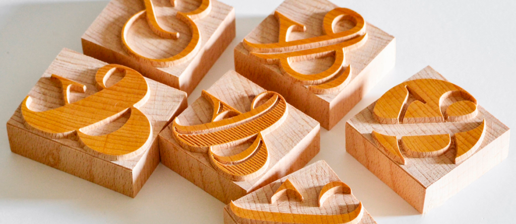
To this day the & symbol is included in the design of all new fonts, and is part of every Latin alphabet in existence. There are so many variations of ampersand, especially in italics. Although it has been gradually stylized, it still retains the combination of the basic “e” and “t” forms.
This historical provenance is clear in some characters that separate the letters more sharply, such as Rotis Sans, Trebuchet and Bebas Neue.

The most widely used ampersand, however, is the Carolingian style, and it is the one seen in most existing fonts. It is found both in serif fonts, including Didot, Bodoni, and Bembo, and within sans serifs, such as Akzidenz Grotesk, Helvetica, and Univers.


In addition to these simple ampersands, used more in round typefaces, there is an italic style that, influenced by calligraphy, shows more vibrant curves. This style is generally very elegant, and has generated really imaginative and diverse symbols.

There are several interesting variations of the ampersand, including those created by Ludovico Degli Arrighi, a master engraver and typographer of the Renaissance, and Robert Granjon, a 16th-century French type designer.
The 1992 Poetica font, based on the ancient Cancelleresca (calligraphic script used in commerce since the 13th century), and created by Robert Slimbach for Adobe, offers a rich collection of 58 ampersand variations.

& in corporate identities!
The ampersand has become an icon, used widely for logos and typography. It is a common font in the logos of several well-known companies, including the multinational telecommunications company AT&T. The mark consists of a globe with blue and white stripes, and the company name in sans serif font. In the field of consumer products, the ampersand has been used by the company that produces the “colored button-shaped chocolates,” M&M’s (Mars & Murrie Ltd), and by the famous Head & Shoulders, an American company that specializes in the production of anti-dandruff shampoos. This is owned by The Procter & Gamble Company (P&G), which in turn uses the ampersand in its logo. Another famous example is the Toni & Guy hair salon chain, founded by two brothers from Campania who moved to London in the 1950s.

In the arts, the Victoria and Albert Museum in London has perhaps the most successful logo that includes the use of &. The symbol helps visually complement the letter A, and the result is harmonious. The communications agency & Walsh also relied on the ampersand for its identity. In this case, the character also has the function of creating a link between the company and the client (client & Walsh). Mondadori Electa publishing house, which specializes in art and design publications, uses a variant of & for its brand.


In fashion there is also a strong ampersand presence. In high fashion, we find the Italian luxury brand Dolce & Gabbana and & Other Stories, a company born from the collaboration of a small group of creative people. However, this symbol is also famous within “fast fashion,” such as in the logos of H&M and Pull&Bear.
The most striking feature of the ampersand is how much this symbol has always been present in the history of typography and graphic design, and how it still is today. Initially made famous by its function as an abbreviation that saved valuable space, it is now an iconic typeface that is widely used in all industries and in so many types of communication.02