
According to the dictionary, a resume is “the list of titles, awards, roles, jobs held, biographical data, etc., that qualify a person.” This definition does not hint at the harsh reality and it is estimated that recruiters take about six seconds in deciding whether to throw the document in the trash or, on the contrary, pay more attention to it.
So there are no second chances. When applying for a job, we need to think of ourselves as a marketing product. Because, ultimately, what we try to do is sell our brand. Therefore, our academic background and work experience are as important as knowing how to present data in an attractive way to make a good first impression. And choosing an appropriate font is one of the keys to differentiating yourself from the competition.
Fonts convey messages and generate emotions
For a number of years now, there has been scientific evidence showing that typeface affects consumers’ perceptions of a product or company, as well as recruiters’ perceptions of job seekers. For example, a study by Wichita State University in the U.S. state of Kansas revealed in 2006 that fonts such as Times New Roman and Arial are associated with “stability.” Courier New and Georgia convey “maturity,” while Agency FB symbolizes “rigidity” and Kristen “emotion.”
In addition, if the font is consistent with other aspects of marketing such as visual elements (e.g., in the case of the resume, design, format, style), the recruiter is more likely to store messages such as “this candidate possesses the right skills” or “inspires confidence” in their head. Font choice has a great impact on the likelihood of being hired because we link certain aesthetics and words with emotions, character traits, and moods.
The most readable font families
Given the huge variety of fonts, how can you figure out which one might be best for your resume? Recruiters agree that when choosing fonts, we should mainly consider two factors: professionalism and readability. Professionalism refers to the style, the tone, which should reflect that the person can do the job seriously and efficiently. As for readability, we need to make sure that the resume is easy to read on different media: print, computers, tablets and cell phones.
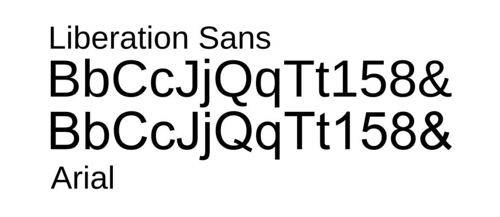
Fonts are divided into groups or “font families” that are similar in origin and have only small variations between them, although they can generate a very different impression. For curriculum, the most recommended are Serif and Sans Serif because of their high readability. The main difference between these families is that Serifs have very distinctive endings or tails at their ends, while Sans Serifs (Arial, Century Gothic, Helvetica, Geneva, MS Sans Serif, Tahoma, Trebuchet MS, Verdana…) do not possess this ornamental trait.

Although there is disagreement about what is the best font for a resume, most recruiting experts often report the following as essential:
- Arial. This classic font is one of the most popular for writing resumes. It is a good option because it has clean lines and is easy to read. However, some point out that it has become common enough that it looks boring. https://www.fonts.com/font/monotype/arial
- Calibri. Appeared in the early 2000s as a Microsoft Word replacement for classic Times New Roman. It is considered a safe option because it reads well on most screens, even when it is italicized, bold or in headlines. https://www.fonts.com/font/microsoft-corporation/calibri
- Cambria. Another popular font that takes the place of Times New Roman and with which recruiters are very familiar. It is designed so that it can be read well on the screen and even when printed small, although it is not as formal as other fonts. https://www.fonts.com/font/microsoft-corporation/cambria
- Garamond. Named after the 16th-century type designer Claude Garamond, its appearance is also inspired by the design of that time. It has a distinct personality and is ideal for academic or literary resumes and for those with many years of work experience. https://www.fonts.com/font/urw-type-foundry/garamond
- Helvetica. This typeface, one of the best known and widely used worldwide (especially by typographers and graphic designers for corporate brand logos), is an excellent choice for resumes because it is modern yet classic and easy to recognize. It projects symmetry. https://www.myfonts.com/fonts/linotype/helvetica/
- Didot. It is particularly suitable for the creative sector such as fashion or photography, as, with its high lines, it conveys style and sophistication and inspires a bit of fantasy, but remains readable. In other types of resumes it can be used for titles. https://www.fonts.com/font/canada-type/didot
- Georgia. This is another of the best traditional-looking alternatives to Times New Roman. The font was created specifically for clarity on screen monitors, so it reads well on any digital document, even if the resume is sent as a PDF. https://www.fonts.com/font/microsoft-corporation/georgia
- Book Antiqua. This is a Roman typeface based on the pencil-drawn letters of the Italian Renaissance. Recruiters recommend it when we want to give the resume a different look than the more geometric designs of most texts, ideal for professionals in the arts or humanities. https://docs.microsoft.com/en-us/typography/font-list/book-antiqua
- Side. Lato in Polish means “summer,” which gives us an idea of what it wants to convey. It is very natural and has multiple styles and thicknesses, so it is perfect for combining texts and titles for each section of the curriculum. One advantage is that it is open source, so it can be downloaded for free. https://fonts.google.com/specimen/Lato
- Roboto. If we are familiar with it, it is because it is the font used for Google Maps. It is less formal than others, so it is not recommended for academic resumes or very formal work environments. It is similar to other Web-optimized fonts, but has a more subtle and elegant typeface. https://fonts.google.com/specimen/Roboto
Other tips when submitting a resume
When choosing the appropriate font for submitting a CV or cover letter, we need to consider other aspects, such as trying not to combine different fonts in the same document. Similarly, bold and italics should be used sparingly, only to highlight key aspects or separate sections.
It is very tempting to include all background, academic or professional, in the resume, but if we include too much content, we will tend to reduce the font size, which makes it difficult to read. The optimal size would be about 11 points. We must remember that one of our goals should be to make the prospective employer read our document well, so the easier it looks, the better.