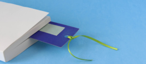
The bookmark is the reader’s best friend.
A useful tool, but also a companion, which preserves the traces of each reader’s journey and keeps timely memory of it.
According to the Italian Publishers Association, there are about 29.8 million Italians who have read at least one book in the last year. Of these, about 5 million are strong readers, meaning they manage to finish at least ten books in a year.
Why am I telling you this?
Because all these readers need a simple and irreplaceable tool to facilitate their reading: the bookmark.
The bookmark: its history in a nutshell
The bookmark appears in human history with the production of the first manuscript books, probably in the first codices. It appears in Europe, Africa and Asia and is mostly rigid (made of wood, bone, gold, metal), because the book is still a unique and valuable object.
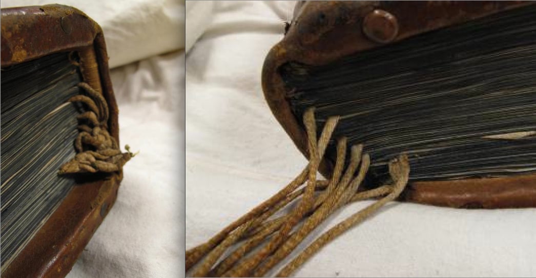
https://medievalbooks.nl/2014/09/22/smart-medieval-bookmarks/
It was during the Middle Ages that the foundations were laid for the bookmark as we know it now, with the use of ropes, leather strips, and ribbons of fabric, all the way to the first bookmarks made of paper or thin wood, going so far as to develop ingenious and unique solutions such as rotating bookmarks.
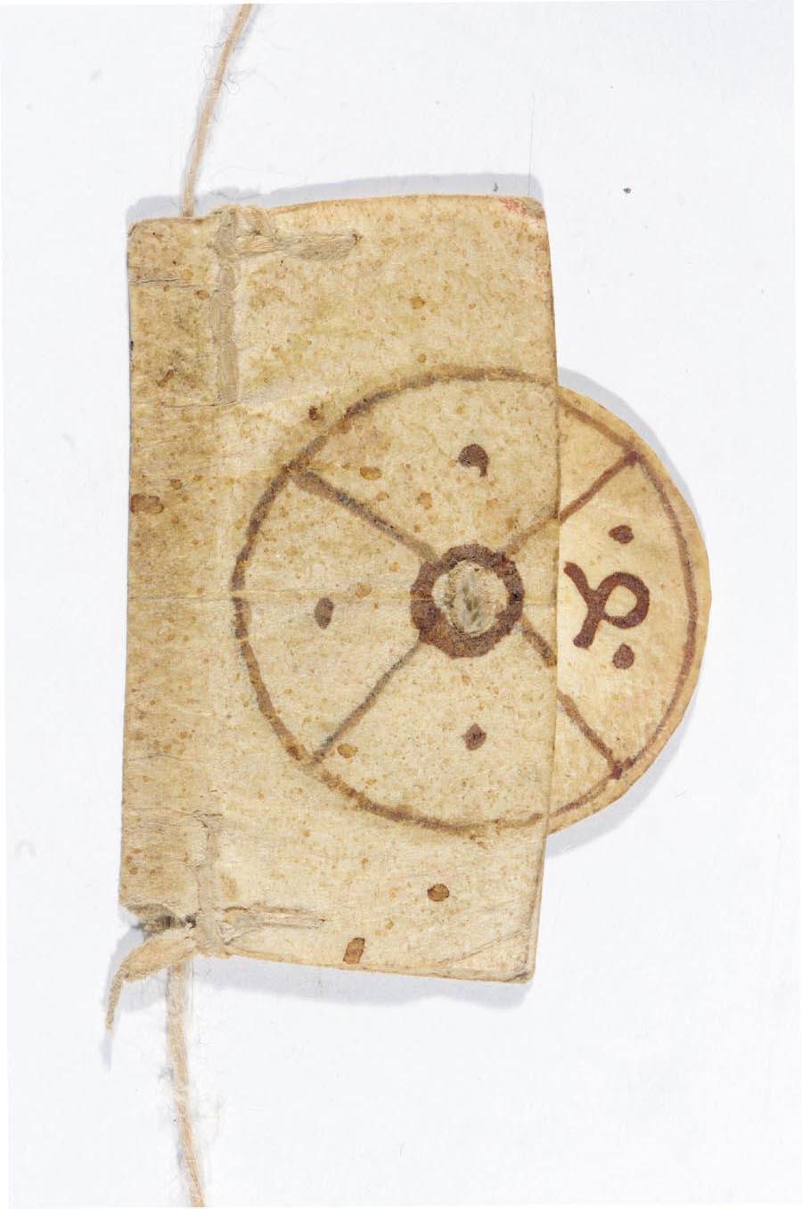
https://en.wikipedia.org/wiki/Rotating_bookmark
In the nineteenth century, the bookmark became the tool we also know: printed, made of paper and often with a hole in which a string is knotted. And since then, with the invention of advertising and increasing literacy making the book a mass product, the bookmark becomes an important player in business promotion.
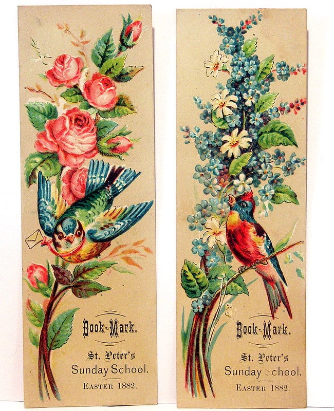
https://www.flickr.com/photos/_nyctreeman/4284513179
Bookmark: helps the reader and… keeps him company!
The bookmark is an object that is handled and seen many times, indeed it can become a “companion” object to be used and reused for different readings.
It must be useful, but also beautiful, fun, intriguing: in short, it must make people want to use it.
It is not a business card: wrong, in my opinion, are those who fill the bookmark with information, offers, texts. One must be able to resist the urge to fill it!
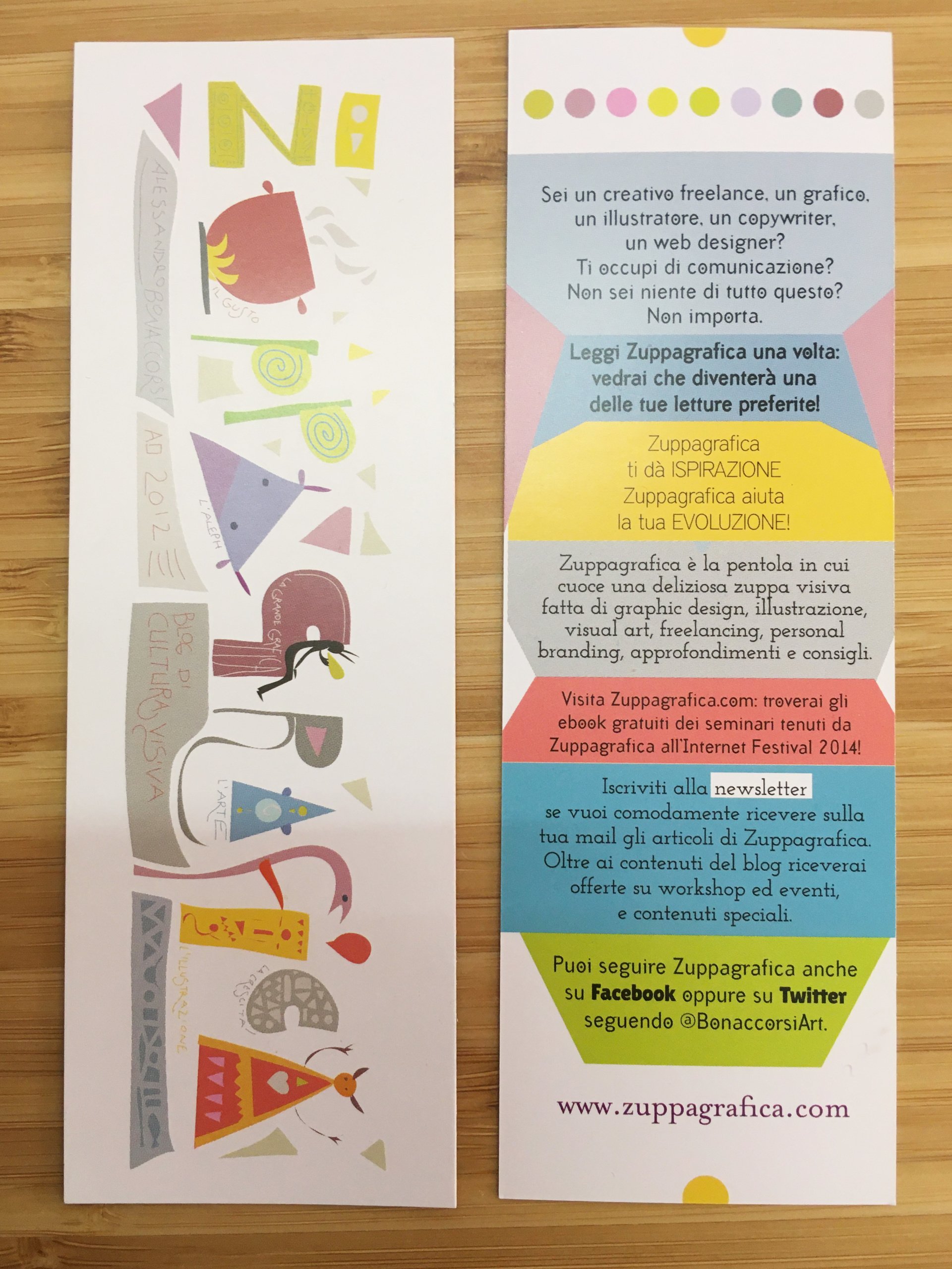
For example, this is a bookmark I made many years ago in which I wanted to put a lot, too much information, to promote my blog at the time. Everyone perceived it as a mini-flyer, a kind of unusual card, and no one would use it except casually between the pages of a book.
Bookmark: the steps to follow to best design it
The bookmark is a simple graphic product, but that is precisely why it is important to design it well and make no mistakes.
The first thing to do is to choose the right format and paper.
Let’s take a quick look at the recommended sizes and types of paper to prefer to make a bookmark that works.
1.Choose the size of the bookmark
The size of a bookmark should fall between:
- 5-8 cm wide
- 12-21 cm in length
These are the size ranges, because the bookmark should be able to fit smoothly inside a book, whose smallest standard sizes are around 14-15 cm in length.
On our site you can find offers for the standard 5×21 cm format, which is suitable for larger books
2.Choose the type of paper for the bookmark
The paper of a bookmark should be thick enough, without reaching the weight of a cardstock: 150 to 250 grams are all fine. The finish, if any, you choose also matters a lot. If the paper chosen for the bookmark is recycled or natural, it does not need finishing, but a coated paper might yield more with a lamination.
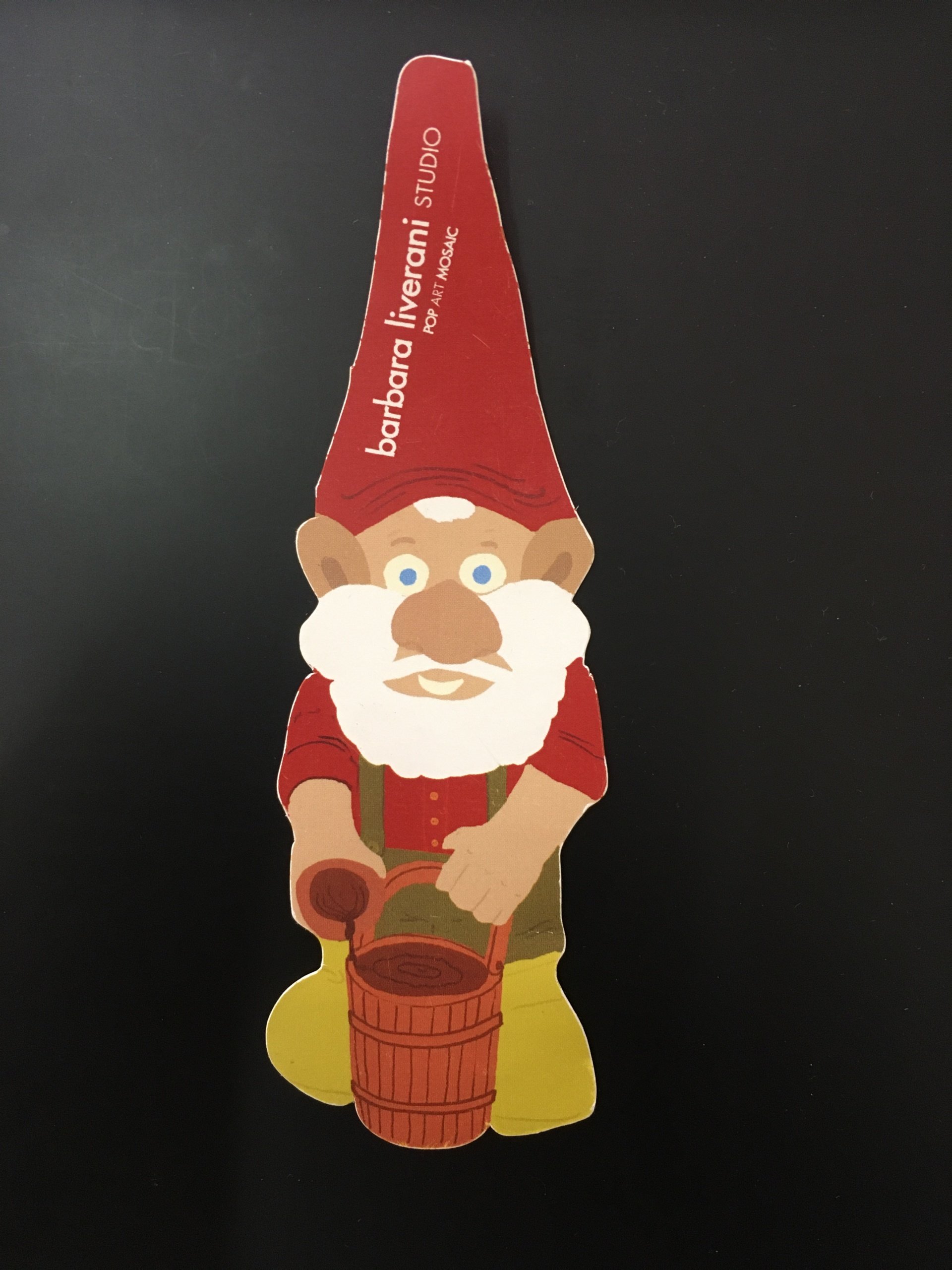
For an “alternative” bookmark, a shaped form can also be considered; in this case the product of choice becomes the custom die-cut tag.
https://designrshub.com/2013/04/bookmark-design-ideas.html
3.Understanding how a bookmark is composed: front and back
The bookmark consists of two parts: the front and the back.
Given printing costs that do not vary, it pays to use both. A backside left blank will give the idea of cheap and unkempt.
The front is the most important part of the bookmark, the one that is striking (and we will address this in the next section), the back contains a short informational text, a possible call-to-action (very short though) and contact information (name, website, e-mail and any phone or address).
Once the basics of the design have been established, one can proceed with its graphic design. As mentioned above, the bookmark must strike a chord, it must have something to make it fun or lovable. The bookmark must convey “something” that adds value to its function. A function that can be fulfilled by any shred of torn paper, toilet paper at worst.
Sounds easy to do better than paper towels, doesn’t it? It’s not, it takes effort!
Deciding what a bookmark should look like
But how do you go about choosing what graphic appearance to give your bookmark?
There are basically two ways to make a bookmark:
- use an image
- use a phrase
Let’s quickly look together at these two different ways of approaching the aesthetics of a bookmark.
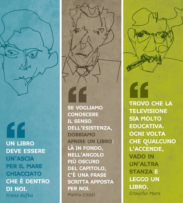
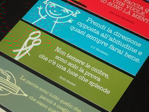
Bookmarks with a sentence
Graphically speaking, perhaps phrase bookmarks are more complex: choice of color, font and its size will affect the final result so much.
The best advice that can be given is to be simple and consistent with the project of which the bookmark is a part.

Bookmarks with image
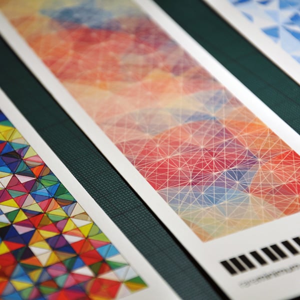
Bookmarks with image are the most common and precisely because of this it is difficult to be original and recognizable.
They can be distinguished into:
- bookmarks with famous paintings
- graphic bookmarks
- bookmarks with illustrations and drawings
- bookmarks with pictures
This is not a very different classification from what we might do for book covers or postcards, but the image needs to be studied or cut in a vertical format, narrow enough to look like a slit. So it is difficult to find the right image or cut right away.
The advice is to try again and again, printing drafts, to see which image or cut works best.
On the other hand, when we are the ones who make or commission the image, we definitely need to be creative and imaginative: it is not enough to put a logo or the image of a good illustrator for the bookmark to work.
https://www.behance.net/gallery/7389625/The-Art-of-the-Bookmark?tracking_source=search%7Cbookmarks
Creative bookmark: some examples
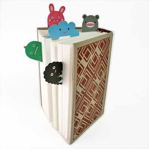
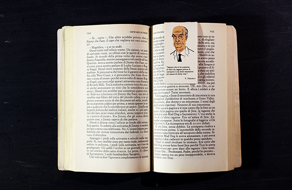
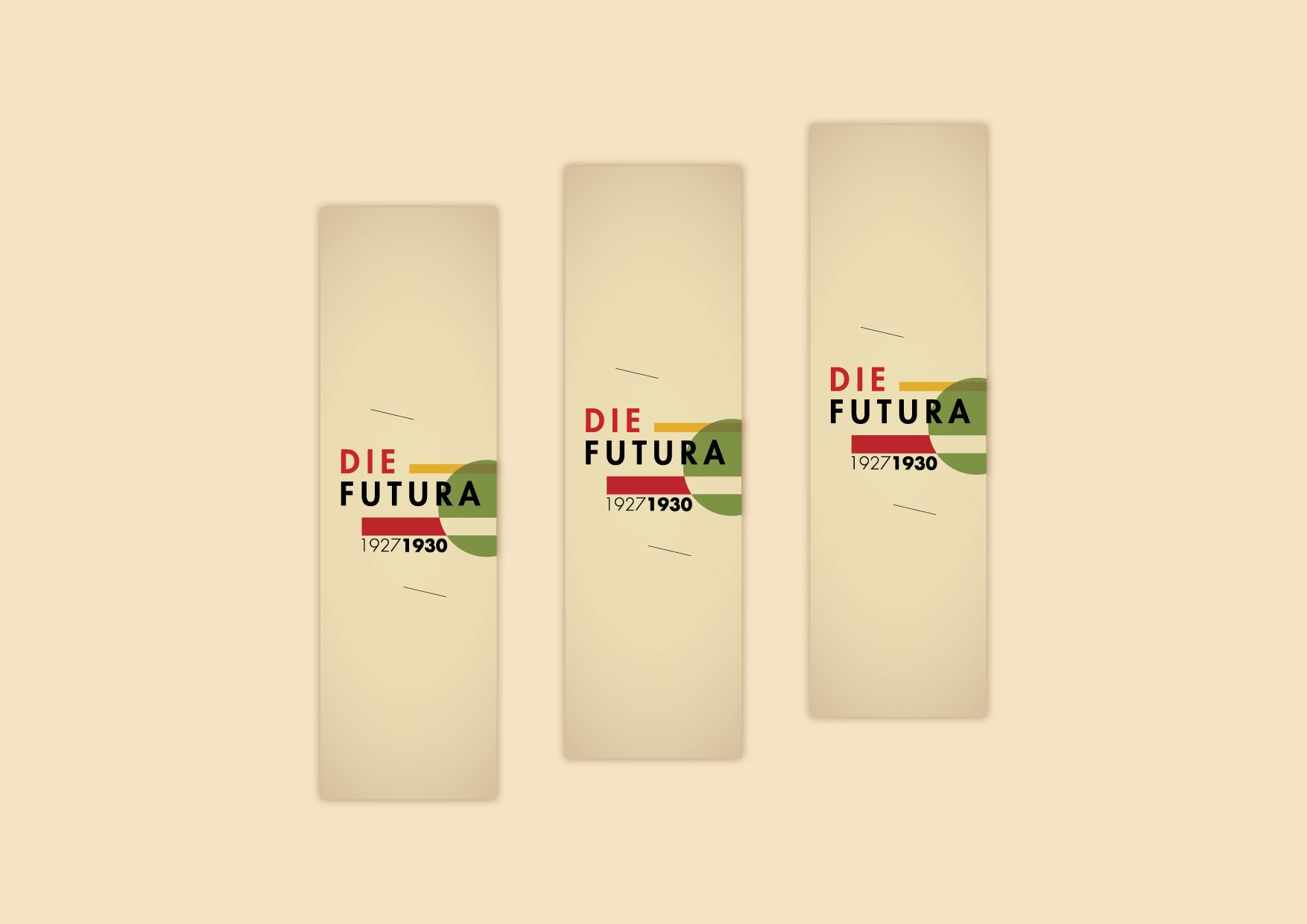
One of the most popular ideas for designers is to play with the function of the bookmark, thus with its role in reading or its position within the pages, as shown by the examples.
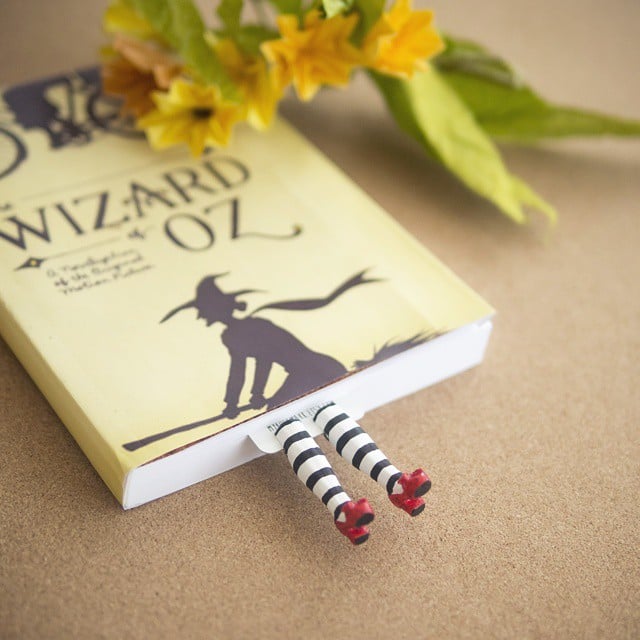

https://designrshub.com/2013/04/bookmark-design-ideas.html
Let’s not forget that the bookmark being inexpensive and potentially intended for all who read, it can also be perfect for non-commercial uses, as in the case of this Australian nonprofit that publicizes good practices against Hepatitis C.
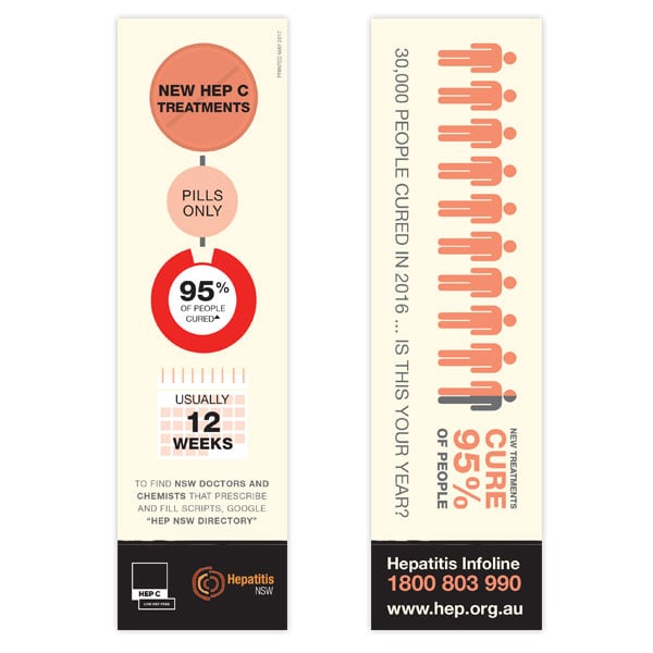
https://www.hep.org.au/product/bookmarks-hep-c/
For the perfect bookmark? It takes imagination!
In conclusion, the bookmark is one of the items where graphics and images can have a lot of fun.
Use it to promote yourself or your clients, use it to publicize and raise awareness, give it as a gift or sell it. The important thing is that you make the bookmark a fun, clever, beautiful, whimsical product because it can really be the key marketing tool for many promotional campaigns or to make you visible and remembered.
Good work!
Here you can find 10 examples of curious bookmarks to inspire you: https://www.creativebloq.com/graphic-design/bookmark-design-1131695

