
Designing graphics is a job that is considered fun, highly creative, definitely cool. And indeed, those who design often feel that way, a little bit of an exalted, a little bit of a genius: they know they have an audience who will look at their work and touch it and think and feel something because of that object. However, somewhere between the creative process and the relationship with the audience-two exalted, fantastic moments-there is another one that everyone tends to forget: the moment of “executions,” that is, preparing the files for printing. Everything that used to be exaltation turns into icy sweat dripping down from the temples: will some mess happen in print? Will I get something wrong! Will the product come out the way I thought it would-or won’t it?!!!
And from that day begins a pang in my heart that ends only with the printer’s delivery of the finished product. And there’s no experience to be had: even after a lifetime of work, the agony of fear of getting it wrong remains.
Of course, times have changed, and only twenty years ago some mistakes could stop a printing job for a whole day: now with digital, even being able to correct a job in progress is possible and easier. But some errors can only be seen when the job is finished….
What are the most common mistakes we are likely to make when we send a file to print?
Let’s see.
- Sending to print with the RGB color profile
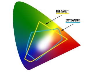
This is one of the most common mistakes, one of those things we pay little attention to as we hop from Photoshop to Indesign. Yet getting the color profile wrong is a terrible mistake. As they teach us in school: RGB is the additive color model that uses light (hence monitors), while CMYK is the subtractive color model that pigments (hence printing) use.
In the image you see the two color models compared within the spectrum of colors visible to the human eye. As you can see they are very different, especially in the rendering of some colors such as greens, some deep blues, some reds. What you see on the monitor can be very different from what will result from printing.
Always, therefore work on files for printing converted to CMYK model.
https://dba.med.sc.edu/price/irf/Adobe_tg/models/rgbcmy.html
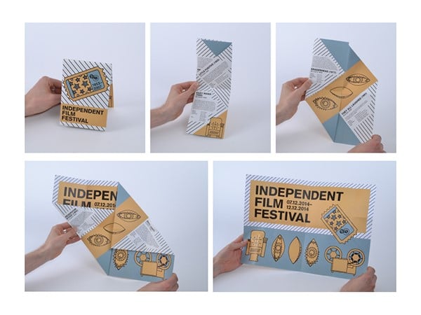
- Getting the verse or pages of a foldout wrong
The foldable, even just the classic 3-sheet, is not that easy to layout: we have to take into account the print verses and how it will be opened.
It is easy to get it wrong, especially if you are a novice.
So always print a draft and do a test of the folds and where and how to layout, so you can handle the file well in Illustrator or Indesign
- Forgetting abundance
The classic beginner’s mistake: you send the file to print and there is no abundance, i.e., margin for cutting.
A 1mm. wrong cut seems like a trifle, but if we have forgotten the abundance it will show so much: in fact it will create an annoying white line on the margin that can ruin even the most beautiful graphic design… unless it has a completely white background!
- Don’t phone it in
You prepare the file on our computer, then place the order online and send an email. Lo and behold, the file is gone, you can go out for a well-deserved beer. As if everything works automatically….
We forget that there will be someone on the other end who will receive the file and open it and check (some services check automatically). Reading well the warnings and guidelines of the typography service you choose, remembering that you can call or email to understand the more complex technical issues, can avoid nasty surprises and hiccups, just as we are enjoying that beer.
We need to think of working with the printer as a collaboration: the finished work will be better the more good communication there has been between the designer and the printer.
- Sending the wrong file to print
This is a more common mistake than people think, and it can be solved with a little organization.
To avoid it, just name the files you work on progressively, from 0 or 1 for the first round of draft until you need it, or name the file by date of change, or with codes indicating the stages of processing (draft -> final -> executive).
- Misusing colors
There are many ways to misuse colors. The problem is that when we see the file on the monitor, all the colors are vivid and intense: after all, they are backlit and especially for those who have crystal screens, the colors have fantastic rendering.
Then when you go to print, you have to deal with the opacity of the paper, varying light conditions, ink yields, and the famous CMYK pattern mentioned above.
And it happens that the printed product disappoints expectations.
We have to be careful and already know what the color traps are:
- in print colors that are too light can turn out even lighter;
- text and backgrounds must be well contrasted, because on the monitor bold combinations are readable, but in print they are not;
- pay attention to the rendering of greens ché in print the range available is very small;
- on certain papers that absorb a lot, dark colors may muddle and become even darker or lose detail;
- black is a big ugly beast to print.
These are just some of the most common mistakes or distractions that happen when we have to send files to print. To combat them even paying attention may not be enough (we are often at the end of processing and may be tired). The advice is to organize procedures that are always the same to allow us to better control the process, use all possible control tools found in software (such as Indesign’s PreFlight or Preliminary Verification), and print a draft of what we will print.
It is a shame to strive to make great designs and then print bad products….