

“Even the eye wants its share,” goes the famous saying.
Nothing could be truer! Especially when it comes to a book and its cover. The cover of a book, in fact, is the “dress” that immediately strikes the reader, even before picking it up and leafing through it. And just as one dresses appropriately to make a good impression at a ceremony or an important event, in the same way one must take care of the aesthetics of the cover and layout of one’s book, even though anyone can now have a book printed in his or her name.
Who does not have an uncle or relative eager to publish a book of his or her memoirs for children and grandchildren to read?
Twenty or thirty years ago texts of this kind made copy shops richer and had the form-object of the mimeograph, with a paperback cover when you wanted to invest, stapler pins to hold the sheets together when you wanted to optimize costs.
The cover of a book is the “dress” that immediately strikes the reader, even before leafing through it.
For the past decade or so, a market has flourished related to self-production and self-publication of books, in which the author is his or her own publisher, i.e., a self-publisher.
Therefore, your uncle today can produce and publish a book more cheaply and with higher quality. In short, if you have your manuscript done and finished, now is a great time to publish it inexpensively!
Book cover and layout count! Even for self-publishers
The self-publishing market is increasingly flourishing: in Italy alone there are roughly 30,000 authors who self-publish books and ebooks each year, preferring fiction, especially autobiographical or fantasy, but not disdaining illustrated volumes for children, photo reports, cookbooks and various manuals.
The problem for book publishers is to create a product that is perceived to be of quality, thus as similar as possible to books from the best publishers found in bookstores. It is clear that graphic choices such as book cover, layout quality, and printing can make a difference and help disseminate texts worthy of attention. In this sense, a book cover, if done well, is the best way to draw attention to your manuscript and increase its visibility and sales.
In this article we will focus on 5 short tips to follow before publishing a book. These are tips that will help you choose the cover of the book you want to print and take care of its layout. Of course, these tips come into play when you have done the “bulk” of the work. Only when you have written your book, are satisfied with the quality of the manuscript, sure of the goodness of the content, and certain that spelling, grammar, and syntax are correct, then it will be time to focus on our tips for publishing a book that looks good.
We will cover:
- Finding the cover image
- Choosing the font for the cover
- Layout correctly
- Publishing the book
Book cover, book aesthetics, layout and readability are often overlooked, overwhelmed by the enthusiasm to publish a book quickly. Yet, they are essential elements of producing and publishing a well-done book. Because a book that looks good and has an attractive cover will more easily attract possible readers. Let’s look together at these aspects to keep in mind.
1.Book cover: choosing the right image
“Covers are important because every book, beyond its shape or size, needs a face.”[1]. This is a quote from Chip Kidd, probably the most famous and irreverent book cover designer in the world, the one who became famous by creating the logo used for the book (and then movie) cover of Jurassic Park.
The book cover is the first thing we see and it has to catch the eye in a positive way. A cover with sloppy graphics and an inconsistent image will make the published book less appealing, just as a bad title will do your volume a disservice.
The first thing to do is to choose an idea (a concept) that can tell or represent the content of the book and then design the book cover accordingly.
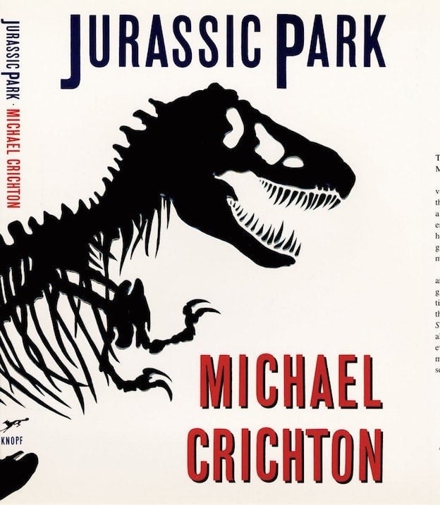
In the case of Jurassic Park, the concept was the dinosaur as we see it in the museum, and the design was made small and then enlarged. That black, monstrous skeletal silhouette tells well of the suspense that runs through the novel. A book cover that has become a real trademark, world-famous.
The book cover is the first thing we see, and it must catch the eye in a positive way.
Once the idea is established, we need to look for a suitable image that is consistent with our concept.
We can rely on stock images (either free or paid), or we can commission or purchase them from a professional (designer or illustrator).
Useful sites for buying images to use for the cover
Below are some useful sites where we can purchase images:
Always remember to be well informed about the rights of use of images purchased or downloaded from the sites listed above. Some images can be used for books or publications only within a certain circulation limit, for others, however, credit must be given to the author. For the latter, it will be sufficient to cite the name of the author of the image, usually on the back of the title page or back cover.
So be sure to check the rights to use images in publications before you doc them for your cover. Better to do this before printing and distributing the book, rather than having to withdraw copies or pay monetary penalties for copyright infringement.
Contact freelance illustrators and graphic designers for the cover.
In addition to images, if you are not a graphic designer or illustrator yourself, you can contact a freelance illustrator, designer, or graphic designer for them to develop the cover of your book. If you know a graphic designer you trust, you can ask him. Otherwise, you could take a look at the images you find on Behance: you can locate the photographs, graphic works, and illustrations that most inspire you and that you find most in line with your cover idea. Behance is a kind of online aggregator for graphic designers, illustrators, and illustrators, and it allows you to peruse their portfolios, their creations, and get in touch with those you find interesting.
There is also the Fiverr platform, which allows you to get in touch with freelance illustrators and graphic designers from all over the world, from whom you can commission your work starting from a low price base.
There is no better solution: once you have identified the idea around which to build the cover, then you must be inspired by looking and browsing until you find the photo, image or illustration that you think will best embody the cover of your book.
Once the image is chosen, we need to cut it the right way. Often the detail of an image works better than the whole image.
Try doing a search on Google or Pinterest with these keywords “best book covers” or “best book covers” and you will see dozens of fantastic examples of book covers to inspire you.
2.Book cover: choose font and color
The font is as decisive as the image for the success of a book cover: using a delicate image with an aggressive font gets a different message across than a delicate font used for the same image.
From a graphic point of view, we should design a book cover like a poster (that’s what Bruno Munari used to say), because it has to be visible from a distance and easily recognizable.
Riccardo Falcinelli, an art director, designer, and popularizer who has been working in editorial graphics for years, put it this way in an article for Il Post, “It is essential that there be a single focal point. This is especially true for fiction that appeals to everyone, less so for high nonfiction that speaks to those who already know. As for colors, in Italy they are always more or less the same: red, white and black for essays; yellow, black and red for fiction.”
Let’s avoid fonts that are too strange because they draw all the attention to themselves: if image and title are strong enough and representative of the content, better to play it safe with classic fonts, differentiating between sans, serif and slab depending on the type of book (fiction or essay and what fields). You can find out more tips for well-designed covers before publishing a book here.

https://www.adelphi.it/
3.Book covers: examples to be inspired by
Perhaps the easiest advice to give is to take inspiration from those who have been publishing books for a living, and well, for years: publishing houses.
Each publishing house has its own style and way of designing books and choosing their covers.
For example, here you will find a curious insight from The Post into the fonts used by Italian publishing houses. As you can see there are many important expedients before publishing a book, from which there is no escape.
Looking at, breaking down, measuring the graphics of the covers we like is a good way to understand them. Not only that: we try to take cues from the formats that publishers use to decide how we want our book to be perceived (cheap, luxurious, content-rich, funny, light, in-depth, etc.). Publishing a book also means positioning it in the marketplace: imagining who its ideal reader might be and preparing a cover that gives it a look that is consistent with the story being told, that they might like.
4.Beyond the book cover: Designing the interior (layout matters).
Beyond a book cover, a well-done layout needs to be fixed before publishing. This will make the book easier and smoother to read, and when a book reads easily the author’s voice is perceived as more serious and credible by readers. Marketing a book with an attractive cover but a neglected page layout is like selling a car with the engine of a Ferrari and the body of a cheap hatchback.

https://www.flickr.com/photos/federiconovaro
It is important to design the page layout well: the difference between publishing a good book and publishing an amateur book is the small details. They are the details we tend to overlook, yet they are needed to have pages that are readable and facilitate the reader’s eyes to easily focus on reading and let the imagination gallop, without disturbing graphic elements.
Here are the details related to page layout that are often overlooked:
- margins: this is the space between the text and the page trim; it must have a proper distance from the edge, so that the text block is proportionate and in the center of the page; the inner margin, the binding margin, must also be considered, because too little space condemns the text to disappear into the darkness of the fold;
- Headers and page numbers: these serve for the navigation of the reader, who thus orientates himself within the book; they must inform without disturbing; the page number can be in the corner or in the center of the lower part of the page; these elements play a decisive graphic role in the most creative books (photography, illustrated, graphic, etc.);
- Initial pages: publishing a good book also means introducing the reader progressively to the contents, following age-old typographical rules; there is a more or less typical sequence of pages, which is distinguished into the frontispiece, buttonhole, title page, colophon, and possible guard pages; knowing these and knowing what they should contain makes the book more credible;
- Checking for orphans and widows, rightness and justification: good layout, as well as good editing, are the basis of reading enjoyment; checking for lonely words at the beginning of a page or at the end of a paragraph, lines that are too short, and spaces between words (caused by incorrect rightness, incorrect kerning, or poorly designed fonts) that create annoying optical effects, and finally that justification and hyphenation work properly.
Publishing a book that has taken you weekends, nights and time off neglecting these aspects is a real crime. Remember: after all the work done, a final effort is needed to take care of these details as well.
5.From book cover to layout: it’s printing time
Have we identified the right book cover and the clearest layout to facilitate readers? We are almost there then! Before we send the book to print, we need to check the file settings required by the printer to whom we go.
Once the information is acquired, we proceed with the production of the PDF, not before doing a preflight check, which is a simulation that allows us to find any errors in the file for printing. Adobe Indesign has a very thorough Preflight Check function.
The most common errors are:
- Images or colors not converted to CMYK (which is the color model used in letterpress printing; you can learn more here);
- Damaged fonts;
- Links to images that do not work and thus use low-resolution images;
- Hidden or empty text boxes.
Once everything has been checked, we are ready to finally print our effort: all we have to do is take the PDF, send it to the printer, and wait for an e-mail or phone call to notify us that it has been printed.

When you have finally printed the book and are in front of the filled boxes, you will look forward to opening them to have in your hands, at last, the result of your labor and be able to disseminate the stories, images, and reflections you have printed. You will have before you not only a book with an apt cover, but also a book that is easy to read and aesthetically pleasing. Publishing a book is a bit like facing a small journey, but with a little patience and the right care, the result will be a great satisfaction for you and your readers!
[1]https://99designs.it/blog/book-design/chip-kidd-book-cover-design/