
Stanley Kubrick is among the most famous directors ever, if not the most famous. He has made relatively few films, 13 in a career spanning nearly fifty years, yet in each of them he has thoroughly explored ever new feelings, stories and settings: from deep space to the Vietnam War, from ancient Rome to the intimate psychology of a couple.
The sequences in his films seem to have thus imprinted themselves, more or less unconsciously, on our imaginations-the monolith in 2001: A Space Odyssey, Jack Nicholson’s hatchet in The Shining, the pedicure in Lolita and the druggie walk in A Clockwork Orange.
But what typefaces did Kubrick use to introduce such powerful scenes? And what anecdotes lie behind the lettering of his most famous posters? You guessed it: today we offer a roundup of the fonts Kubrick chose in some of his most famous feature films, along with a curious analysis of his typographic passions.
Dr. Strangelove
Stanley Kubrick in his filmography managed to range from thriller to war film, from historical film to erotic film. With Dr. Strangelove – AKA: How I Learned Not to Worry and Love the Bomb, released in 1964 and his seventh film, he tried his hand at comedy.
In this black satire Stanley Kubrick puts his audience to the test by bringing to theaters a parody of the Cold War during the very years of maximum tension in the conflict between the United States and Russia. The film is full of dissonant elements-humor and dramatic themes, erotic urges and death-that many critics say are the binary on which the whole film stands.

Even the opening titles play on contrast by pairing almost childlike lettering with a scene depicting the aerial refueling of a military aircraft (according to some a metaphor for the sexual act). The creation of the titles is entrusted to Pablo Ferro, a Cuban designer who up to that time had worked mainly on advertising. He would also later collaborate with Kubrick on the hypnotic trailer A Clockwork Orange in addition to signing the titles of more than 100 films including The Addams Family, Men in Black and Beetlejuice.
Pablo Ferro’s lettering departs from those most commonly used up to that time in cinema: it is informal, extraordinarily elongated and subtle. Perfect for what Kubrick wanted: to simultaneously show the text and the important images in the background. It worked so well that the director filled the entire screen with credits!
2001: A Space Odyssey
2001: A Space Odyssey, Stanley Kubrick’s sci-fi-themed film, also came out at a particularly significant time: it was 1968, and just a year later man would set foot on the moon for the first time.
The opening credits of are probably the most iconic of the director’s entire output with images of a sunrise shot from space, accompanied by the unforgettable notes of Richard Strauss. The film’s title appears in the extremely legible and defined characters of Gill Sans, perhaps one of the most classic sans-serif fonts so much so that it has been called “the British Helvetica.”
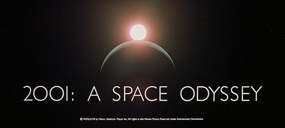
Eric Gill designed the font in 1928, based on the typeface used at the time in the London Underground and with the intention of competing with a number of sans serif fonts very much in vogue at the time, including Futura. The font indeed was an immediate success and today is used in many famous logos including that of the British broadcaster BBC and the Tommy Hilfiger brand. A curiosity: in the title of Kubrick’s film, the zeros in “2001” are rendered with the letter font O.
Instead, for the poster of 2001:A Space Odyssey, Kubrick chooses precisely the Futura font, which, as we shall see, is one of the director’s favorite fonts. Further fueling the entanglements between the moon landing and Kubrick’s film is the fact that the plaque left on the moon by the American crew celebrating its “conquest” is engraved precisely in Futura.
The Shining
That Stanley Kubrick was a perfectionist and extremely punctilious is a well-known fact. Few may know, however, that his strict demands also concerned lettering. One anecdote concerns precisely one of his masterpieces: the psychological thriller The Shining, released in 1980.
The lettering used in the playbill was done by Saul Bass, the New York graphic designer and illustrator who revolutionized the world of cinema with his movie titles and playbills – producing real masterpieces for Hitchcock (Vertigo, The Woman Who Lived Twice and North by Northwest Intrigue), Ridley Scott (Alien) and Stanley Kubrick himself (Spartacus). But Saul Bass’ fame did not save him from Kubrick’s punctiliousness.
Saul Bass submitted no less than five drafts for the playbill for The Shining, but none of them satisfied the director, who had complaints about the chosen lettering: “too difficult to read” or “not compact enough,” the director commented (full story here). Kubrick is said to have had over 300 sketches made for him before he was satisfied.
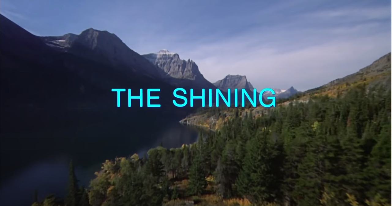
Thinking instead of the opening scene of The Shining, it’s hard not to get caught up in a particular angst: a very long shot follows the family’s car as it creeps through a remote, mountainous landscape, the music underscores concern, but the final touch is the font. A neutral Helvetica-also one of the most famous sans serifs-contrasts with everything else through a highly disturbing element: color.
Barry Lyndon
Barry Lyndon (1975) is Stanley Kubrick’s second film with a historical setting that follows the adventures-and more importantly the misadventures-of an Irish gentleman in 18th-century Europe. It is a highly visual film in which the aesthetics are maniacally attended to, suffice it to say that it is all shot with natural light, candles and oil lamps, thanks to a special lens made by Zeiss optics for NASA.
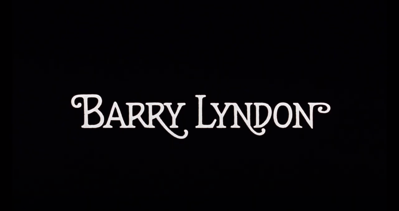
Barry Lyndon is also a work that departs from the rest of Kubrick’s output for two reasons: it is particularly far removed from the director’s usual themes, and it is one of the very rare instances in which graceful characters (with particularly pronounced swirls) are used. Accomplice is the intervention of Bill Gold who, after weeks of intense exchange of ideas with the director, will design the poster and the entire alphabet of characters that Kubrick will use in the film, including for the credits and individual chapter titles.
Bill Gold is a graphic designer known for designing hundreds of movie posters, including those for Casablanca, The Exorcist, Perfect Murder, and for his long collaboration with Clint Eastwood.
Eyes Wide Shut
Eyes Wide Shut is Stanley Kubrick’s closing film-the director died the same year the film was released, 1999-and is a drama with erotic overtones. The opening credits are shown full-screen on a black background; they are defined and heavy but let us glimpse for a moment, as if through a crack, the sequence in which Nicole Kidman drops her dress. The font used for the titles is Futura, in the Extra Bold variant.
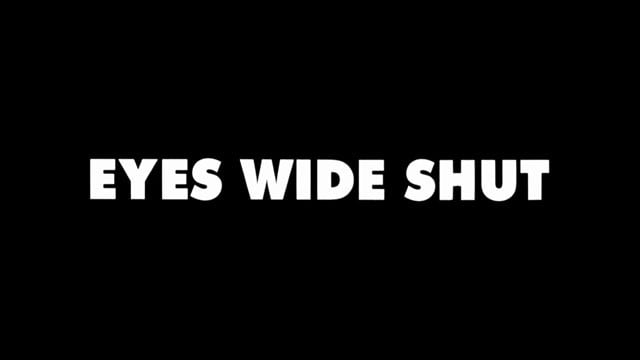
In an interview a few years ago, Tony Frewin – Kubrick’s longtime personal assistant – recounts how Futura was the director’s typeface and how he often tried, unsuccessfully, to persuade him to use pardoned fonts. In fact, Kubrick would not use Futura that often: within the credits we see it only in his last film, even it will actually be chosen in several posters and trailers.
So, the visual richness of Stanley Kubrick’s films is often accompanied by classic, clean, graceless fonts. Simple typefaces that in the hands of other filmmakers might almost come across as banal. But Kubrick, through his cinematic technique, makes them powerful and virtually indelible from memory along with the most famous opening scenes of his films. This is one of Stanley Kubrick’s magics: being able to turn the simplest and most foundational elements into icons – be they fonts or sentiments.