
Futurism emerged in a period of considerable turmoil as a revolutionary movement whose purpose was to renew all art forms consistent with the technological and industrial innovations that were looming. Futurism emphasized speed, technology, youth, violence, and objects that embodied these qualities, such as the car, the airplane, and the industrial city in general. The traditions of the past were to be disrupted in order to focus on the dynamic present.
The typographic revolution spearheaded by Filippo Tommaso Marinetti
Between 1909 and 1944, the years by which we conventionally denote the beginning and end of Futurism in Italy, the treatment of calligraphy, typefaces and typography testifies to the spirit of breaking with the past. Indeed, there is a rejection of typographic, as well as literary, conventions that had been consolidated over centuries, in favor of more expressive and less rational compositions. Indeed, the composition of letters on the page was to visually reproduce utterances and verbal expressions.
The Futurist typographic revolution began in 1912, when Filippo Tommaso Marinetti composed the first “words in freedom,” compositions in which words have no syntactic-grammatical link to each other and are not organized into sentences and periods. The style is revolutionary as much phonetically as visually. The sonority of the words, often onomatopoeic, and their typographic treatment on the page are paramount elements in a marriage of literature, music, and visual art.

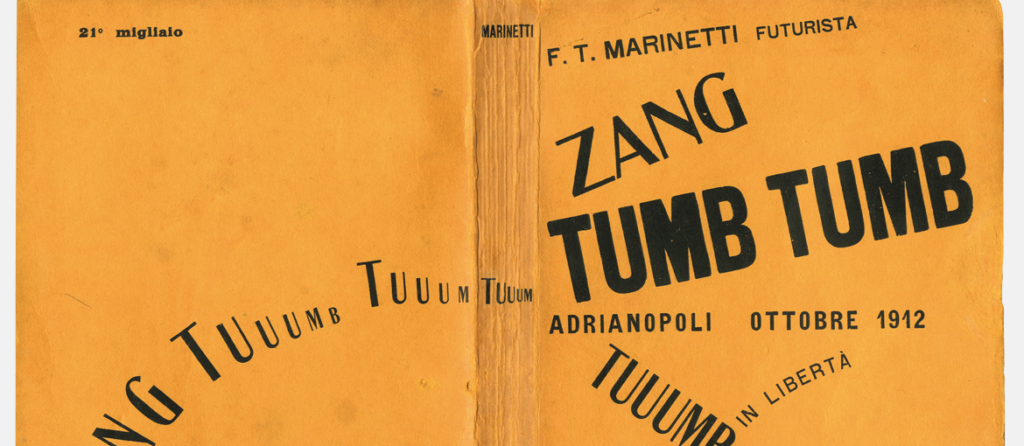
An example of the use of words in the wild comes from Filippo Tommaso Marinetti’s book Zang Tumb Tumb (1914), in which the Battle of Tripoli is celebrated. The title evokes the mechanical sounds of war – artillery, shelling, explosions. The typography reflects the raw, evocative power of language. Instead of following the established rules of syntax and punctuation, the letters live and express themselves on the page.

The Futurist Book
In the manifesto Destruction of Syntax – Wireless Imagination, Marinetti writes:
“I begin a typographical revolution directed against the beastly and nauseatingly D’Annunzian and Passatist conception of the book of verse, the seventeenth-century handmade paper, festooned with ferns and apols, vegetables, mythological missal ribbons, epigraphs and Roman numerals. The book must be the futurist expression of our futurist thought […]. My revolution is directed against the so-called harmony of the page.”
The graphic revolution of Futurism is thus not limited to the page, but concerns the whole book. In the 1920s and 1930s, in fact, the Futurists’ graphic experiments expanded to the forms, bindings, materials and printing of books, understood as real objects.
In 1927 Fortunato Depero, a Futurist painter, sculptor and designer, published the book Depero futurista, a collection of his typographic experiments, advertising posters, tapestries and other works. Depero futurista presents itself as an evolution of the futurist typography initiated by Marinetti, and as the first object-book.
Populated by bold graphic experimentation, innovative layouts, and work in every artistic field, Depero futurista is also known as Libro bolted, as it is bound together by two large industrial bolts.

Reflection on the form of the book expands to materials. The myth of the automobile and aircraft suggests metal as one of the materials that most represent the Futurist spirit. In this context, the “Lito-Latta” in Zinola, established as a machine shop to produce lithographed metal boxes and cans, becomes a center of futurist artistic aggregation. Lito-Latta becomes famous for, among other things, printing two famous object-books lithographed directly on tin: Filippo Tommaso Marinetti’s Parole in libertà futuriste-tattili-termiche-olfattive (1932) and L’anguria lirica. Long passionate poem by Tullio d’Albisola (1934).
The layout of Parole in libertà futuriste-tattili-termiche-olfattive is a continuous surprise; at the same time it emphasizes the materiality of the book, and overcomes its rigidity with explosive and dynamic compositions.
Tullio d’Albisola’s Lyrical Watermelon features lyrical poems by Tullio d’Albisola, each accompanied by a drawing by Bruno Munari, printed in 101 hand-assembled copies.


Bruno Munari, remembered today mainly for his work in the 1960s and 1970s, began his career as a designer in the years of Futurism producing lesser known but equally brilliant works.
In 1937 he lent his contribution to the “Bompiani Anti-Literary Almanac” by editing the photographic montage of the insert entitled “Udite! Udite!” consisting of captions taken from Mussolini’s phrases inserted inside pages with a circular hole pointing at the Duce’s face like a telescope, so that during the reading his face would always be present. Munari later explained how the gimmick concealed a veiled irony: the rhetoric of Mussolini’s speech appears less bombastic and almost comical in this type of layout.

