
Massimo Vignelli was an Italian graphic designer who lived most of his life in New York City. Born in Milan in 1931, he studied architecture and then worked and diversified his activities in the design world: graphics, furniture pieces, interior design, fittings.
Design is one was his motto-and that of his wife Lella, with whom he worked all his life. For the Vignellis, whether it was visual identity, a sign, a chair or a mug, the issues and approach were the same. They designed with the same rigor, consistency and attention to function.
The Vignelli Canon, publishing success on the web
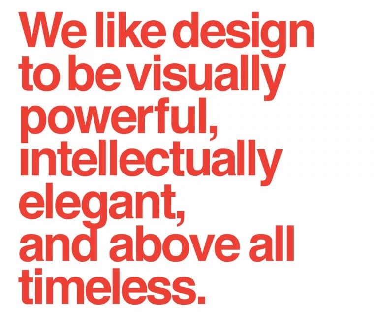
In 2010 Vignelli published the Vignelli Canon[1], a small book, distributed free of charge on his website, where his ideas on design are set out. The book is divided into two parts. In the first, it discusses the intangible elements, necessary for the success of a graphic design project, such as semantics, syntactics, timelessness, responsibility, discipline, and appropriateness.
In the second of tangible ones, with some practical examples. It shows how to build a cage, use colors, manage a text. Most of the examples are taken from projects Vignelli has done during his long career.
According to Vignelli, the search for meaning is the first thing to implement. The search for meaning allows one to better understand the nature of the project and find the most suitable and appropriate direction.
In addition to having “meaning,” a project must be syntactically correct. It must speak the language of design correctly, using the right words, which in graphic design are the cage, fonts, text, and images. You have to make it coherent, relating the elements to each other.
If we make designs that are rich in meaning, syntactically correct, but not very understandable, we are not working in the right way. It is all useless. “Whatever is done, if it is not understood, it is lost communication, wasted effort.”
Vignelli’s works-some interesting examples of his skill
Vignelli’s first collaborations are with architectural firms. In Venice he taught Industrial Design at IUAV, where he had studied but not graduated. The posters for the Piccolo Teatro in Milan are one of Vignelli’s first important works, in the early 1960s. Text-only posters, where the informational element (the title of the opera, the date, the cast) predominated, in contrast to what was around at the time.
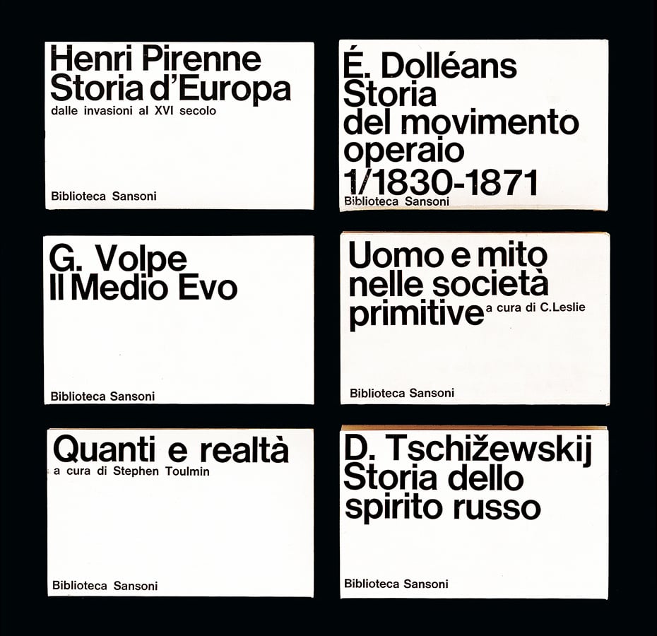
Also in those years, Vignelli designed the Biblioteca Sansoni publishing series and some posters for Pirelli and the Venice Biennale. With Bob Noorda he founded the Unimark studio and designed an editorial series for Feltrinelli.
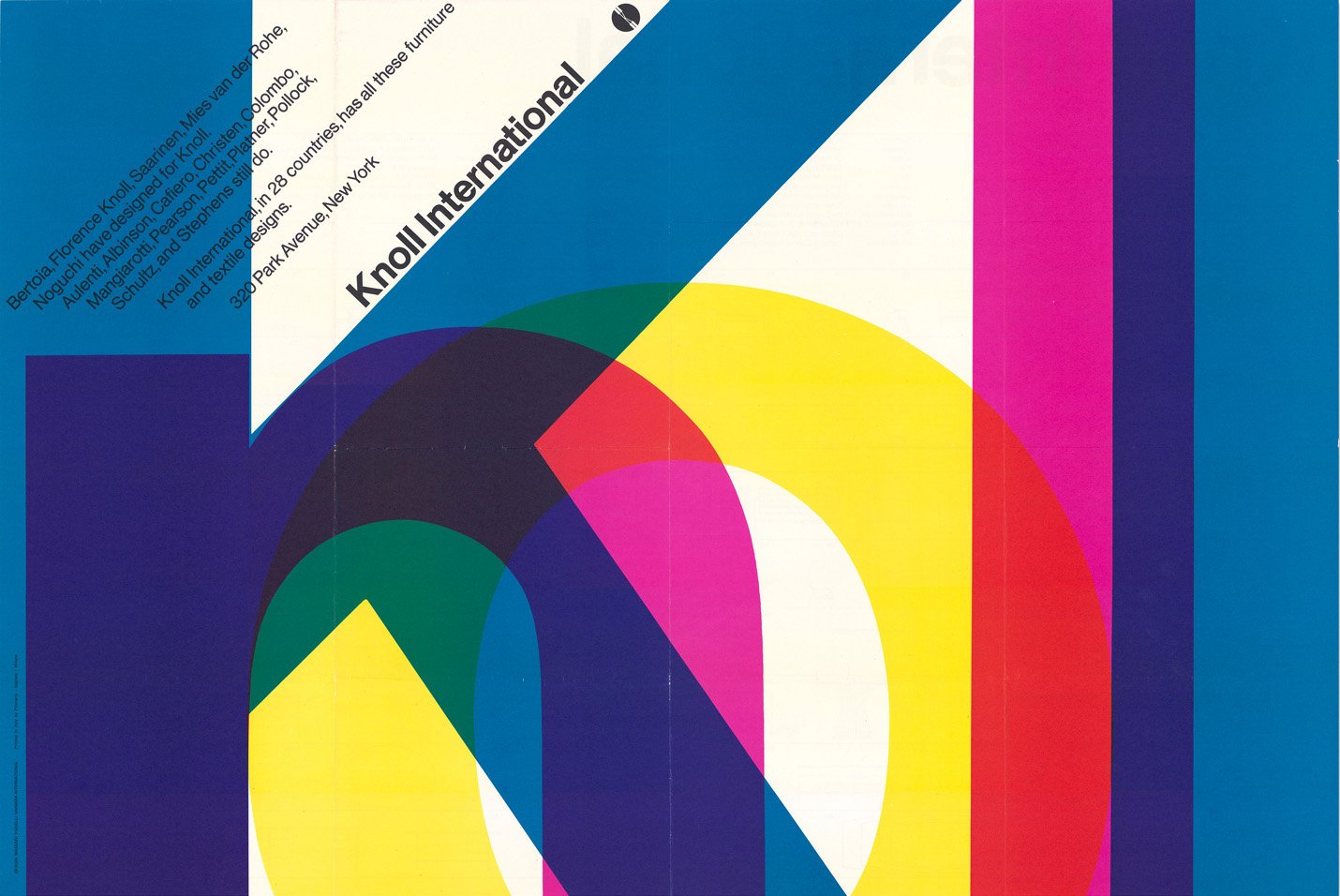
In the late 1960s Vignelli and Unimark move to New York. He opens studio offices in various U.S. cities. He also opens one in Detroit to pursue work for one of his first major clients, Ford. He works for other large companies, such as Knoll and American Airlines, to name two.
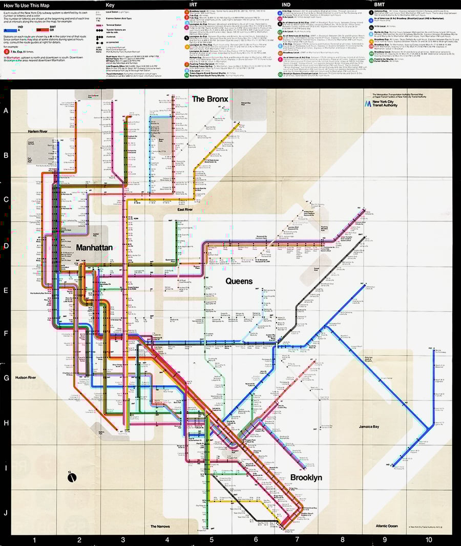
He designs signage for the New York City subway system. Then in 1972 he also designs the subway map, one of his most famous works. A map made only of colored lines and dots, with no geographical references, as all subway maps are today. The manual made for New York subway signage was reprinted a few years ago by Standards Manual.
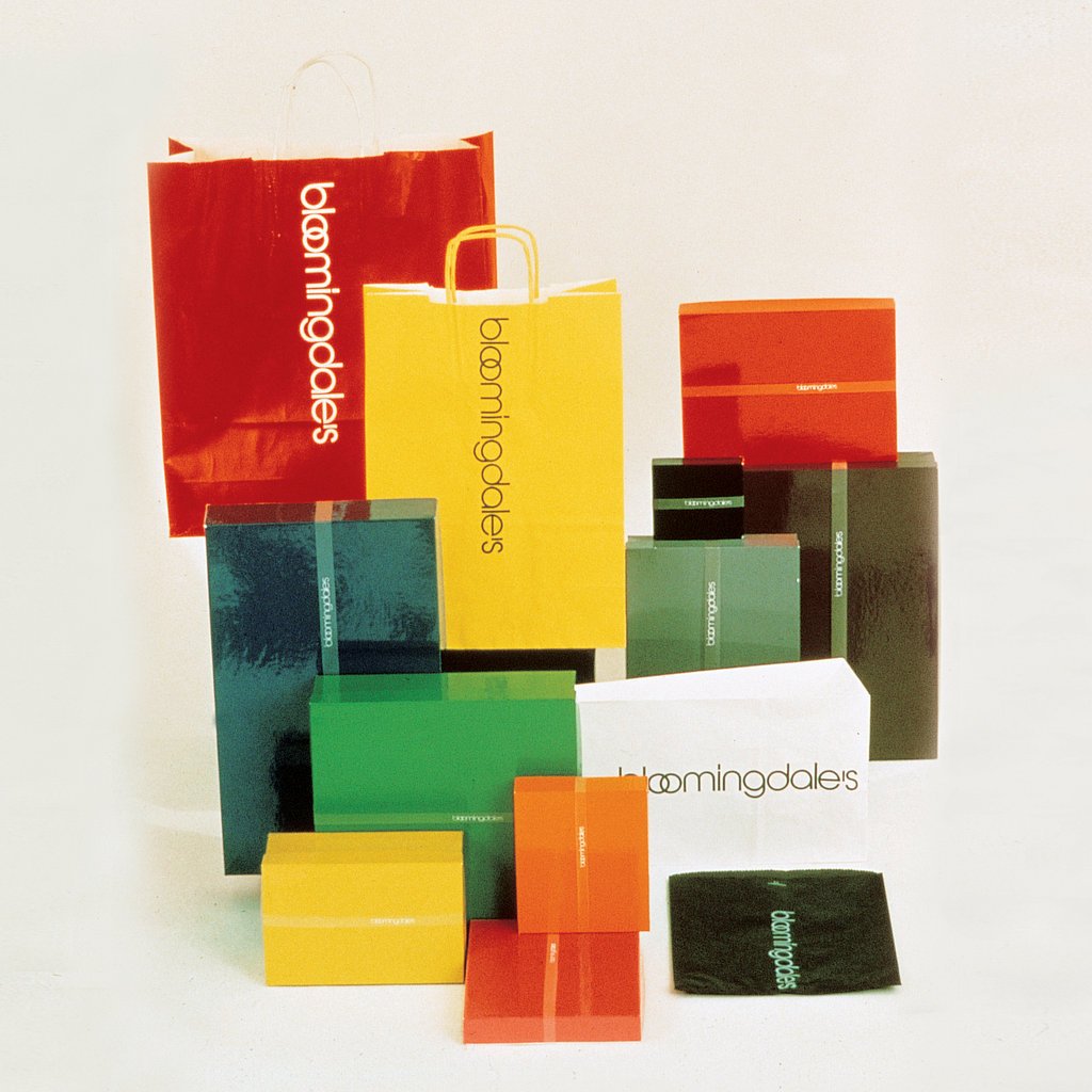
Vignelli then parted ways with Unimark and continued with his own practice. He designs the branding and packaging for Bloomingdale’s department store. Like much of Vignelli’s other work, Bloomingdale’s envelopes and boxes became iconic, colorful, and unbranded.

The brand name was applied only to the tape that wrapped around the box, only to disappear once it was opened. When Vignelli talks about this project, he talks about the balance one has to find between identity and diversity. If you move only between the two extremes, you run the risk of resounding boring or without identity. Too much identity creates redundancy, too much diversity creates fragmentation. Both situations do not help a brand become memorable in the eyes of a user/customer.
A life dedicated to design
Vignelli’s has been a life dedicated to design. So much of his work has become iconic. His work was so influential that David Lasker, an authority on design, once said:
“Virtually anyone living in the Western world will come across one of Vignelli’s works at some point in their day.”[2]
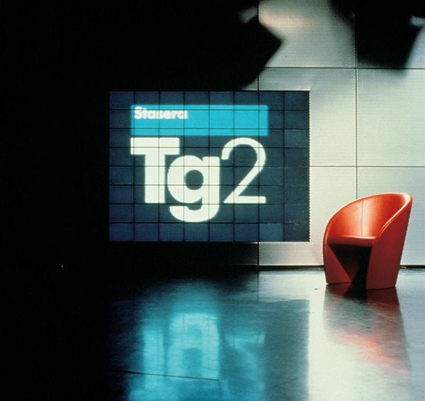
Vignelli has also worked for many Italian clients, Benetton, Cinzano, Lancia, Poltrona Frau, Ducati, the State Railways (for which he created signage). Speaking of iconic works, we also remember the Tg2 branding and interview chair.
Vignelli’s dedication to design led him to design, in every detail, even his own funeral-as Quartz magazine recounted. From the arrangement of the chairs, to his cinerary urn. Urn that is located at St. Peter’s Church, for which, in the 1970s he and his wife had designed the interior.
Michael Bierut, one of the most prominent contemporary graphic designers and a partner in the firm Pentagram, worked extensively with Vignelli. In an article in Design Observer, written soon after Vignelli’s death (in 2014), he talks about his experience with the Italian graphic designer. Bierut thought he would do an 18-month stint, to learn something new, but then stayed 10 years. He writes:
“It was Massimo who taught me one of the simplest things in the world: that if you do good work, you get more good work to do, and conversely bad work brings more bad work. It sounds simple, but it’s amazing how easy it is to forget that in the course of a life of pragmatism and compromise. The only way to do good work is simply to do good work. Maximus did a good job.”
A “total designer”
Vignelli was a total designer. He designed everything, spanning multiple areas in the design world. He designed posters, magazines, newspapers, books, chairs, armchairs, brands, churches, exhibitions, fittings, wine labels[3]. He designed a modular system for printing booklets and brochures for U.S. national parks. America’s national parks number more than 400 and host nearly 300 million visitors each year. A project that still requires enormous printing work today.
In 1977 Vignelli designed, for the National Park Service, the Unigrid system. An A2-based modular grid system that made it possible to create brochures in ten basic formats and maintain a consistent and recognizable structure, with significant savings related to printing and production.
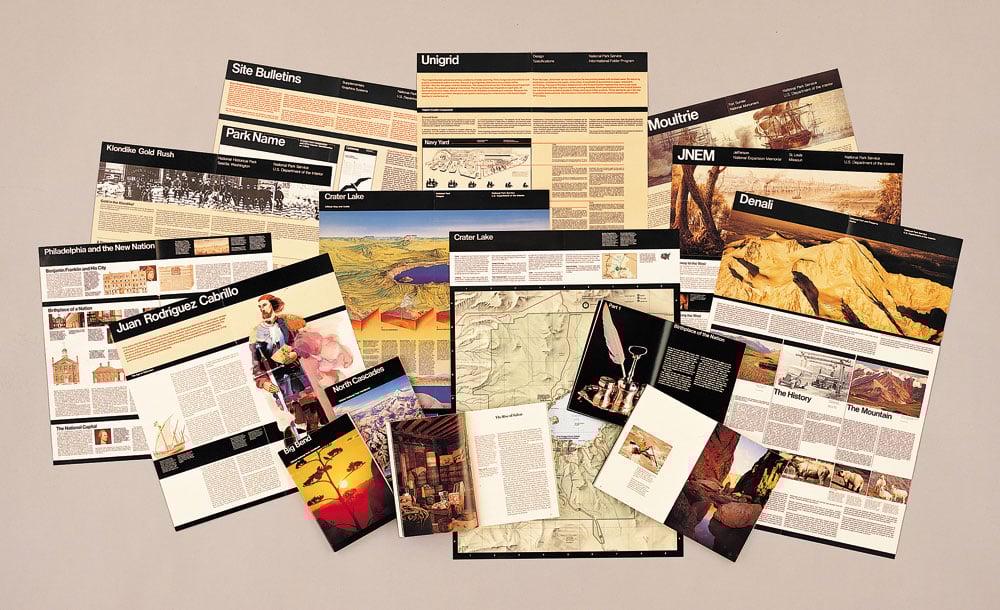
A project that encapsulates Vignelli’s thinking and his approach to design. A timeless project (the Unigrid system is still in use today), where his idea of graphic design, based on the organization of information is fully expressed. A “responsible” design, another intangible value of Canon:
“As designers we have three levels of responsibility:
The first to ourselves and the integrity of the project in all its details.
The second to our clients, to solve the problem in the most economical and efficient way.
The third toward society, the consumer, the user of the final design.”
To elaborate
In this article we have reported a minimum of Vignelli’s work. To explore further I refer to his book Design: Vignelli, a collection of work from 1954 to 2014, the documentary Design is One and the Vignelli Center’s Instagram account.
The Vignelli Center is located inside the Rochester Institute of Technology in New York, and it houses the archive of all of Lella and Massimo Vignelli’s work. At the Vignelli Center you can find things like these: the packaging studies made by Unimark in 1973 for McDonald’s (which later never went into production)
Other Links
- Massimo Vignelli, Design Culture
- Timeless by design,, New York Times Magazine
- Vignelli Gala at the Architectural League, Pentagram
- I.P. Massimo Vignelli, One Of The Greatest 20th Century Designers, Fast Company
- If you can’t find it, you design it, Doppiozero
- Brand Museum
- YouTube interview by the channel Design Speaks Italian.
[1] The Vignelli Canon is available for free in English, in PDF format, and for a fee in Italian, in print format.
[2] The death of Massimo Vignelli, great designer, by Emily Langer – Washington Post (article translated by The Post)
[3] In this YouTube video, Vignelli talks about the design of the labels for Feudi di San Gregorio wines.