
Halloween night is now just a few days away-what better time to dust off a good horror movie classic?
We do it, of course, in our own way! We went looking for the scariest horror fonts from five cinematic masterpieces that have rightfully entered the public imagination, not only for their chilling scenes, but also for their use of horror fonts and unscrupulous lettering in both the official poster and movie titles.

In this short roundup of horror fonts there is the expressionist lettering of the first, unforgettable Nosferatu, the 1980s horror font of Carpenter’s cult movie Halloween, a particular anecdote about Stanley Kubrick and his The Shining… but we don’t want to give too much away! As in good horror movies: a little suspense doesn’t hurt.
1) Font Horror: John Carpenter’s Halloween.

It was 1978 when the horror film was released that would immediately become a cult hit, setting the stage for an entire genre. It is John Carpenter’s Halloween.
Accompanying the release of the first of the slasher films is a poster that immediately enters the collective imagination. The elements are all there: a knife blade wielded by an unknown hand, a fiery and menacing pumpkin, chilling writing, and – at the top – the title of the film Halloween.
The title is white with orange outline on a black background: it is heavy, gothic, but at the same time modern. It is certainly creepy and perhaps also why it will become iconic especially in the 1980s, just think that the same horror font will be used in many other films of that decade.
The horror font used for Carpenter’s Halloween is the ITC Serif Gothic Heavy, created by American designer Herb Lubalin and Italian Tony DeSpigna in 1972. It is a hybrid font that combines the simplicity of Gothic with the elegance of Roman typefaces. However, the same font in its standard version has also found use in less gory films such as the latest episodes of the Star Wars saga The Last Jedi and The Force Awakens.
2) Horror Font: Nosferatu by Friedrich Wilhelm Murnau.

The long shadow of Nosferatu the vampire stretching across the wall as he climbs the stairs to reach his victim…despite being nearly a century old now, the horror classic Nosferatu still manages to distress our imaginations.
The film also draws much of its appeal from the aesthetic touch inherited from the major art movements of the time: German expressionism, art nouveau, and art deco. Grim and disturbing shots, cold architecture, accentuated chiaroscuro…the film’s mournful atmosphere is complemented beautifully by the horror font adopted for the title!
The horror font used is the Berthold Herold Reklameschrift BQ, designed in 1901 by the German Heinz Hoffmann, who was working in the Berthold AG type foundry in Berlin at that time. It is a font that has the characteristics of art nouveau and employs Gothic typefaces that were actually very popular in Germany at the time. If we translate the name of the font in fact, its mournful aura immediately disappears: it is simply an advertisement lettering!
A digital version of the Berthold Herold Reklameschrift BQ can be found here.
3) Horror Font: The Shining by Stanley Kubrick.

That Stanley Kubrick was a perfectionist and extremely punctilious is a well-known fact. Few may know, however, that his strict requirements also affected the lettering and posters of his films! One anecdote is told about precisely one of his masterpieces: the psychological thriller The Shining!
The film adaptation of Stephen King’s novel arrived in theaters in 1980. If you think of the opening scene, it is hard not to get caught up in a particular angst: a very long shot follows the family’s car creeping through a remote, mountainous landscape, the music underscores concern, but the final touch is the font. A neutral Helvetica that contrasts with everything else but has a disturbing element in it: color. The full sequence can be found here.
The font used in the title poster, on the other hand, is specially made by Saul Bass, and our anecdote is about him. Saul Bass is the master of playbills (we also talk about him here): his are the posters for Alfred Hitchcock’s Vertigo and other masterpieces. Despite this he was not saved from Kuckrick’s punctiliousness.
Saul Bass proudly and confidently submitted no less than five poster proofs for The Shining, but none of them satisfied the director, who had complaints about the chosen lettering: “too difficult to read” or “not compact enough,” he commented. The full story can be found here.
4) Font Horror: William Friedkin’s The Exorcist.

Released in 1973, The Exorcist terrorized entire generations. But what about the horror font used? It is serious, almost ecumenical, with a blood red that anticipates the unspeakable to those who are watching it. The playbill is enough to put the viewer in the right frame of mind to watch the film: disquiet.
The lettering was specially designed by designer Dan Perri, using the Weiss Titling font. And it brought much luck to its creator. The Exorcist was the first blockbuster film Dan Perri worked for: with this cult in the portfolio then he managed to grab big projects. In 1976 he designed lettering and titles for Martin Scorsese’s Taxi Driver and especially in 1977 he did the legendary Star Wars titles.
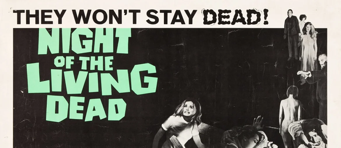
5) Font Horror: George A. Romero’s Night of the Living Dead.

The cult film of the zombie genre was George A. Romero’s debut behind the camera. Not only did it kick-start a new genre for American cinema, but the font used for the poster and titles was very often imitated in subsequent decades or taken as inspiration.
If you want to use it for your own projects, the most similar horror font is the Deanna, created by Chris Hansen and based on the original movie lettering.
It was precisely the film’s original lettering that also played a small role in the lawsuit that George Romero brought against The Return of the Living Dead-a 1985 film by Dan O’Bannon-which, according to the American director, presented itself without right as a sequel to his 1968 masterpiece. Among the elements considered in court was the font: the one used in The Return of the Living Dead was the same as in Romero’s film!
What do you say? Did we make you want to see one of these masterpieces again during the next Halloween night?