
If you are not completely unfamiliar with typography, you will know that when it comes to fonts and text layout, you cannot just appeal to your personal taste. When designing web texts, brochures, books, business cards, posters, flyers, magazines, or any other material that includes a text part, it is important to keep in mind certain typographic and graphic layout rules. We, with this post, want to refresh them for you.
Here we have collected a number of tips that make up our little typographic handbook. It is in pocket format but contains great tips!
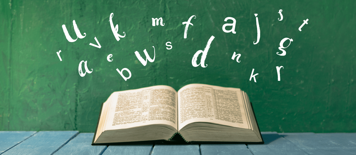
Chapter One. Fonts
To make a great graphic design you need, first of all, great fonts: appropriate to the personality of the brand and harmoniously combined with each other. There are two types of typefaces: serif, with graces, and sans serif, without graces, commonly called “sticks.”
Serifs derive from the Latin script and are the most commonly used typefaces in print on paper, books, magazines and newspapers. The reason is quickly explained: the graces shorten the space between one letter and its next, create continuity and thus make it easier to read long texts on paper.
Sans serifs, on the other hand, are more recent typefaces, born in the nineteenth century. Unlike serifs, they have no appendages and are more linear and dry, making them more readable on screen or in very small formats. In print we find them, in fact, in footnotes, captions, business cards, and even in children’s books.
Now let’s get to the heart of the chapter and see how to combine fonts within a graphic design.
Font choice and font pairing
Fonts guide the reader in exploring the page and tell him or her what should be read first and next. To create these visual hierarchies we play with-as well as with font size-with font pairing, the pairing of fonts. But how do you match typefaces? How do you know when two fonts look good together? Since this is not a “game,” but a job that is anything but simple, we suggest you follow two paths.
First way: take advantage of font families. This road is certainly the most convenient. Choose a font family for your project that includes, within it, a version of the font graced and one without graces. This way you can use, for example, serifs for headlines and sans serifs for the body of the text. You will thus have created a first hierarchy between fonts, without running the risk of unharmonious pairings.
Second way: pairing different fonts. In this case, there are two recommendations we want to make:
- Do not use more than 2-3 fonts in the same project, or you risk getting a chaotic and uncluttered result.
- Do not pair similar fonts together. Usually the more different the fonts are, the better they look together. An example? A modern font like League Spartan, with a strongly geometric structure, looks very good with Libre Baskerville, a font with an elegant, traditional style.

And if you just can’t find the right combination, get help from a font pairing tool. Font Combinations from Canva, for example, starts with a given font and suggests its match. That way it’s really impossible to make a mistake!

Another site we recommend you check out is Typewolf. There you can discover new fonts to alternate with the usual ones you use, read about their history, keep abreast of new typographic trends, and take inspiration from examples of really successful font pairing.

Speaking of fonts, there are two other recommendations we want to make before we move on to the graphic layout stage:
- Pay attention to the tone of voice of the fonts; choose the ones that best suit your design. In general, serifs are more classic and formal; sans serifs have a more modern, technical, and informal font. Keep in mind, then, that each font has its own shade of typeface. Using a Helvetica is not like using a Futura; they are two sans serifs, yes, but the former is definitely more serious than the latter.
- Pay attention to font size, too. To make long texts easier to read, on the web we recommend sticking to a font size of at least 13px; in print, however, you should not go below 11pt.
Now we are ready to tackle the graphic layout chapter!
Chapter Two. A little bit of content design
Once we have chosen the right fonts and combinations, we can move on to the text layout phase. Here it is important to treasure a few tricks that give the layout greater harmony and make the text more readable, especially if it is long.
The division of text into paragraphs. Walls of text scare the reader and make reading more tiring. This is why it is important to divide long texts into paragraphs–not too long!
The length of lines of text. Whether paper or web texts, we also recommend paying attention to the length of the lines, which should not be too long nor too short. There is an “ideal” line length, which usually corresponds to 66 lines. Below and above this value the reader will have a harder time reading.
Arrange for handholds. Long texts? Avoid justified and choose a left-flag alignment, which helps the reader orient and hold the mark. Parallel structures, such as bulleted lists, are very useful access points to the text for the reader. Bolds, which make key concepts stand out immediately, are also welcome. Oh, by the way: don’t use capitals to highlight words or concepts, use bold instead.
Margins. There are no hard-and-fast rules that dictate the width of margins. On a page of text, they range from 1.5 cm to 2.5 cm per side, while the bottom margin is usually higher because it must accommodate notes or page numbers. In the layout of a book, you must also prepare the space needed for binding, which corresponds to about half an inch of inner margin. In the Word sheet you will find the option in: Layout > Custom Margins > Binding.
Line spacing. Line spacing, as you may know, is the space between two lines of text. For it to read smoothly, choose a single line spacing, which will work fine even if you are working on sizes smaller than A4. If you choose a smaller line spacing, the page of text will be too dense and few people will want to read. In general, its value should be between 1 and 1.5. Always remember that, for readability reasons, the line spacing should always be greater than the height of the written line (usually 120% of the font height).
Widows and orphans. What are they? Widows are those words, or very short lines of text, which are found at the end of a paragraph and which leave, therefore, a large blank space in the line. These words are called orphans when they are found at the beginning of a page or column of text. Widows and orphans are typographical errors that disturb the harmony of the page. Also to be avoided would be cut-off lines, those less than one-third of the total line length.
Tracking is the distance between one word and its next. Its value is proportional to the font size and, in general, is greater than the space occupied by the letter “i,” but less than the space occupied by the letter “e.” We advise you not to change this value, which is already optimized for the chosen font. Only in some special cases it may prove useful to increase it. In texts written in uppercase, for example, increasing tracking by 10% could make reading easier and smoother.
Here our little handbook of great tips stops. We hope we have given you some useful tips for curating your graphic designs and making them even more harmonious.