Despite the advance of digital, print magazines are holding out. What is happening is also happening in the music market, where vinyl is catching up and many people are buying it to enjoy a more in-depth (in terms of sounds) and “slower” enjoyment, made of emotions and sensations that digital listening cannot yet give.
A similar thing happens in the world of magazines: while mass-market ones lose sales (but not readership) at the expense of digital, many trade magazines, if not really niche ones, continue to resist and, indeed, increase sales, often becoming exemplary in terms of production and promotion.
These magazines include some with large circulation as well as some niche or almost self-published ones that have worldwide circulations (albeit a few thousand copies).
Let’s say that digital satisfies only a couple of senses for now: seeing and hearing (when content is enriched with video or music), but they cannot compete with print magazines in terms of touch and smell. Taste is not among the senses involved, unless you want to eat the pages….
So, understanding this, publishers and designers have been trying to improve magazines and make them more and more appealing through the satisfaction of additional senses besides sight: using innovative printing techniques, embossing, varnishing and whatnot they have made the pages and covers expressive to touch as well.
The list we propose is by necessity reduced and also takes into consideration a couple of magazines that are out of print or have changed over the years, but the idea is that each of us can buy it at the newsstand or find it in a flea market or at an uncle’s house and look at it, examine it, study it and then, perhaps, design our own magazine idea, even self-produced.
There will always be a need for things to leaf through, to touch, to smell, and we are not made of reading only or viewing only.
So, blessed be magazines always!
The paperback
The first thing to note is that magazines that are important and want to differentiate themselves from the crowd use the paperback binding, not the Stapled. They resemble books, are not disposable, and can often afford a rib. So instead of being in the magazine rack, they ask to be put in your bookcase.
DOMUS
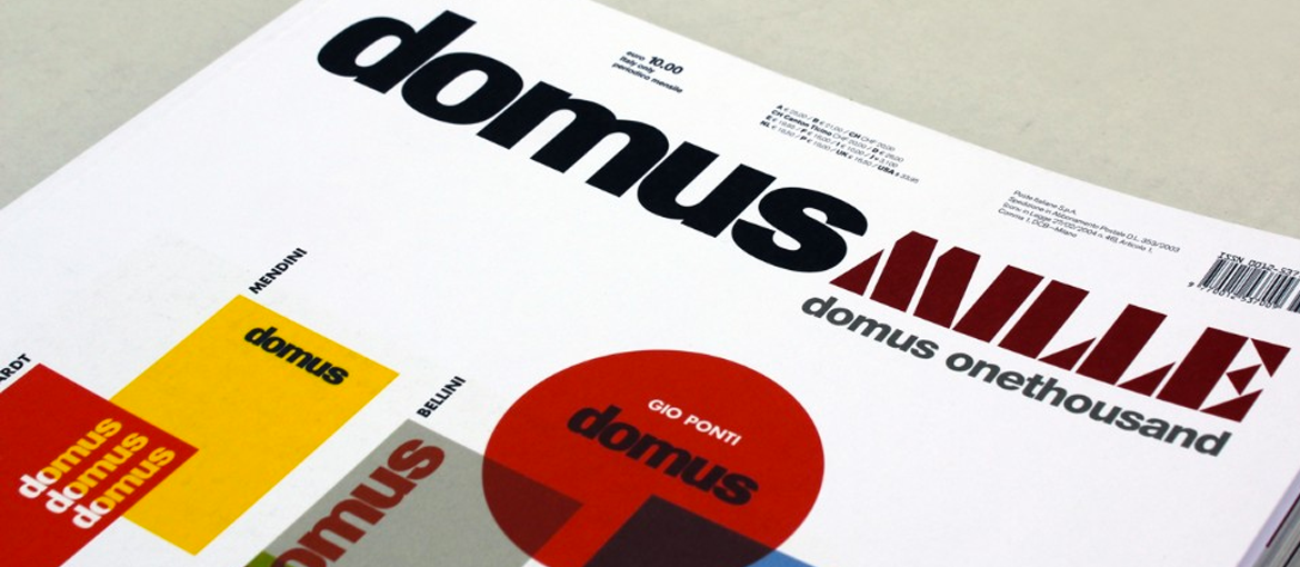
I know, it seems obvious, but the magazine founded by Gio Ponti in 1928 continues to be an important reference not only for architecture and industrial design, but for the entire magazine publishing world.
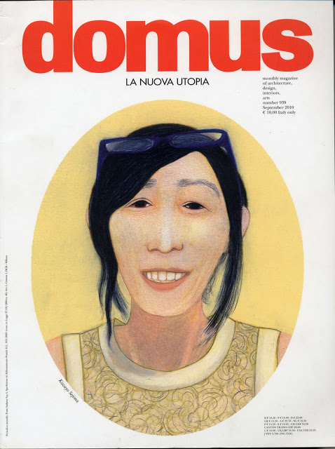
It is 90 years old, more than 1,000 issues have been printed, it is sold all over the world, and above all, it has never forgotten to maintain a high level of graphics and printing, calling on prestigious graphic designers and illustrators to collaborate over the years (one example is the series of cover-portraits created by Lorenzo Mattotti in 2010).
WIRED
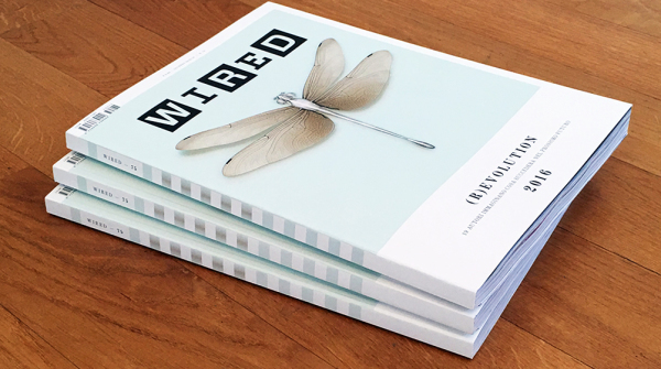
In Italy it has gone through exciting moments and others much less so, but it remains one of the magazines of reference for those who want to discover new printing techniques, fluorescent and colorful varnishes, reliefs and whatnot.
It is a magazine that talks about innovation and technology, and in both graphics and printing it tries to assert this strongly, tracing the way, especially in the international version, for a way of doing graphics that has set the standard both in layout and in the intensive, and often ingenious, use of infographics.
IL – Intelligence & Lifestyle
It is the men’s magazine of Il Sole 24Ore (Italian economic newspaper) that, with a daring but winning gimmick, is bought on newsstands all month long for 50 cents and is not attached to the newspaper (as happened to inserts like Il Venerdì di Repubblica).
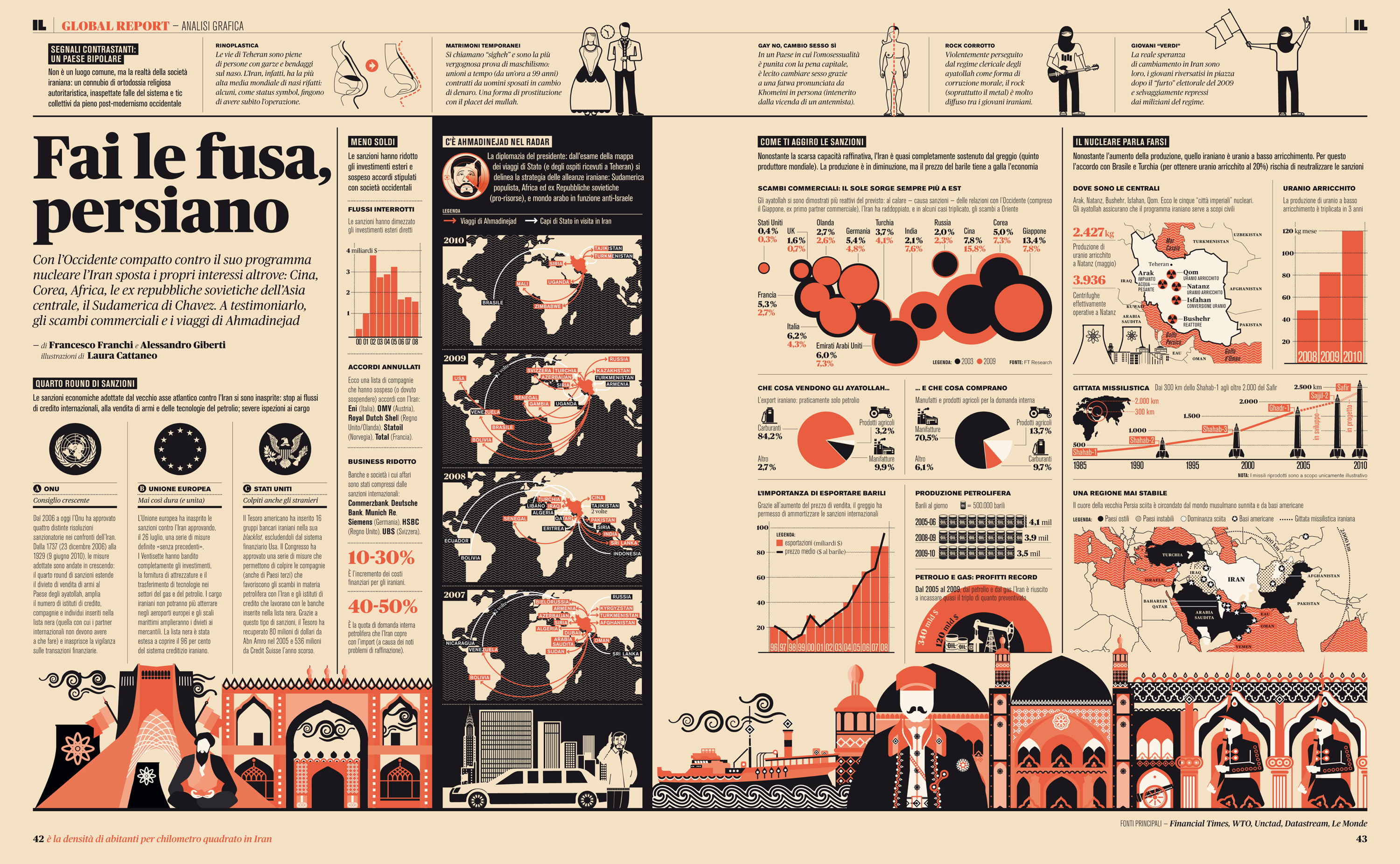
In the early years it traced the elegant and somewhat austere graphics, with Victorian and old newspaper references, of Il Sole, but with the arrival of Francesco Franchi as art director it became the most awarded Italian magazine in the world: it won awards for its content and graphics, so much so that Franchi himself became a star of world Graphic Design.
The large format, lamination and paperback made it an important magazine, but Franchi’s graphic direction makes it a laboratory for effective and innovative experimentation in editorial design.
Infographics here find a special raison d’être because everything can be described through data visualization, even literature.
It’s worth catching up on some back issues and carefully studying the layouts, the use of colors (few and always with that dirty cream in the background, reminiscent of a fine old paper) and fonts, the balance of double pages, the way illustrations dialogue with grids and columns.
A real school.
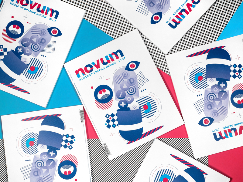
NOVUM
Another historical magazine, founded in Germany in 1924 at the height of the Bauhaus period, and surviving in excellent shape to this day. It deals with Graphic Design through monographic issues and compared to other industry-specific magazines (such as Graphic, Graphic Project or Eye) winks at the latest trends in visual design, being enjoyable and engaging even when it delves deeper into the topics.
Somewhat difficult to find on Italian newsstands (except in bookstores or large cities), it can be purchased online.
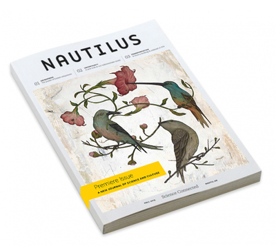
The last example is one of the finest magazines to come out in recent years, both in terms of content and graphic direction. Nautilus is a popular science magazine, beautifully designed and with spectacular use of illustration.
The magazine is sold in the States, but following its issues even just on the web is a boon to understanding how a beautiful magazine with great content and graphic care can still sell many copies and create a passionate audience.
In conclusion, to follow and discover the most beautiful magazines in the world you can follow the Society of Publication Designers, the most important U.S. association in the field, which annually awards magazines. https://www.spd.org
Last report for the MagPile website https://magpile.com/ a kind of community for magazine enthusiasts, where you can discover, buy and read any magazine you can think of, from anywhere in the world!

