
A large Swedish furniture company had the idea many and many years ago to create a catalog in which products were set to make potential buyers understand the features and possibilities of each product. That catalog was sold at newsstands and then, as retail outlets became more widespread, even given as gifts and delivered to the mailbox. That catalog was an object of desire because it advised people how best to furnish their homes and provided a vision that made entire families dream with affordable furniture.
You all know that catalog and you have all flipped through it at least once in your life. You can tell it is a catalog because it has product codes next to their names. Because in fact, for a catalog to be considered as such, it must contain of all products the most useful features for both the salesperson and, for example, the warehouse or shipping person: product code, photo, measurements, price and brief description.
This is what every catalog is made up of: products and information.
A catalog does not tell about a company (it does so briefly in the case), but it shows what the company produces and does so in the simplest and most organized way possible to facilitate a purchase order (whether of the individual buyer or the distributor or representative).
HOW SHOULD A GOOD CATALOG BE MADE?
A catalog generally consists of so many pages because there are so many products. In fact, the word “catalog” comes almost unchanged from ancient Greek and means, simply, list, list. And a list is needed when there are many things.
From a “physical” point of view, a catalog generally resembles a book or magazine. Depending on the number of pages, it may be bound in paperback or stapled.
The size of the page format changes depending on the business sector, but mostly from what the company wants to communicate about itself.
Catalogs for specific business fields (e.g., machinery for industry or trade) often have simple graphics and standard formats such as A4. Companies that produce or trade in luxury goods for example like square and possibly small formats: this is the preferred format for jewelry and watches.
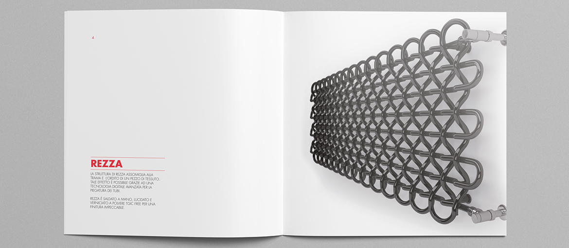
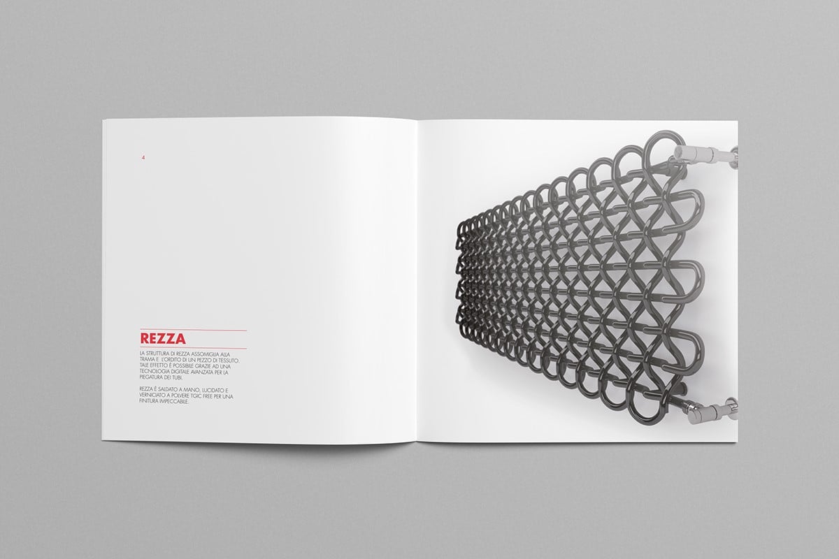
Ambits closer to design and a certain formal sophistication sometimes risk unusual formats, rigid (even hardback) covers, special varnishes, embossed printing effects. For example, we find unusual catalogs in the area of furniture and interior supplies, ceramics.
For those who need to think about a catalog, the advice is to take a look at what competitors and companies in the same industry are doing in other nations. And then decide whether to conform to the standard or experiment with new solutions to stand out.
The catalog after all is a multipurpose tool: it shows products at a trade show but also those in a store (whether physical or virtual); it is handled by the seller or read and reread by the buyer; and depending on the uses to which it is put, one should consider creating different graphic designs.
GRAPHICS AND LAYOUT: CAN YOU BE CREATIVE IN A CATALOG?
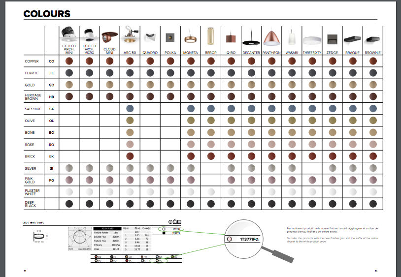
The catalog must fulfill a couple of functions primarily: speed of reference (in the search for product information) and order (in the large amount of data). This is why most catalogs are paginated in tables, where simply on each line appears the product (sometimes with small photo) and then to follow codes, descriptions and features.
To consider the type of graphic design to be applied to each catalog, it is good to consider:
- number of products to be shown: the graphic design changes a lot if we have to include many products on one page or only one;
- quality and importance of product photos: set can be used large, small if they only describe the appearance of the product;
- product sector: comparing ourselves with the catalogs of other companies in our sector helps us decide where to position ourselves, using the most appropriate graphics.
It is not easy to succeed in breaking the mold in a catalog that needs to be well readable and easy to consult by those who handle it, however, it is possible.
In fact, if you have tables, you can use colors to differentiate the various types of products, perhaps with symbols or small geometric shapes.
The layout grid can be dynamic and change within the same catalog without affecting readability: for example, by frequently swapping the positions of large and small photos with each other.
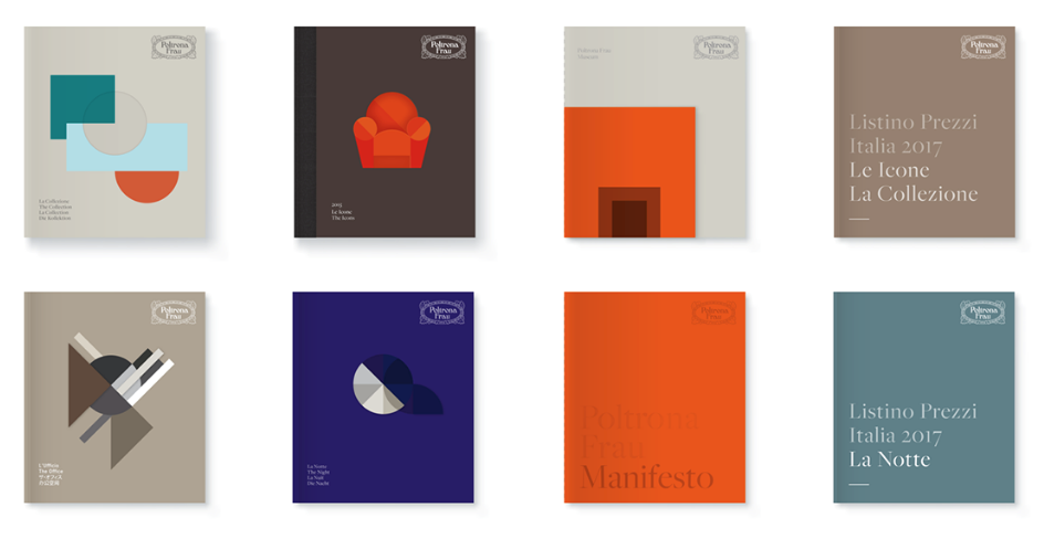
Another way to increase the degree of graphic appeal of a catalog is to work on the pages at the beginning of the section, since the catalog will most likely be divided into parts. On these pages we can focus our graphic research by working on colored backgrounds, fonts, titles, symbols, images, as if each of these pages were a kind of cover page.
Another graphic object that can make the catalog richer is the use of infographics to help highlight the strengths of the products or the use of an infographic layout in which product photos are the focus of a looser layout of codes and features.
CONTOURED OR SET PHOTOS?
The big dilemma for any catalog designer is the photos that the client will provide. And they are also for the commissioning company, which must ask itself whether it has all the photos it needs and if so, whether it should photograph new products and in what way.
The photos should have consistency in terms of how the products are photographed: location, lighting, and any backgrounds.
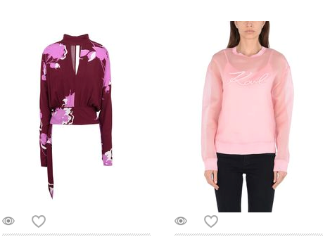
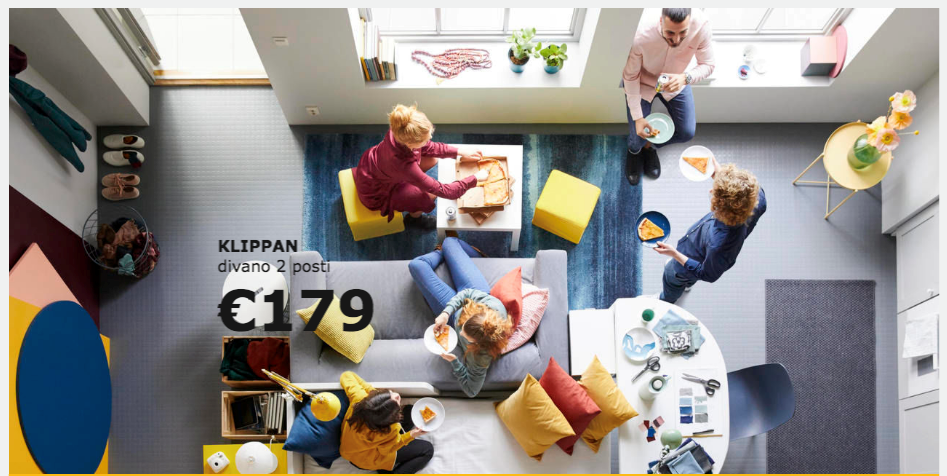
In the clothing industry, one must decide whether to photograph the dress worn by a model or to photograph it without. In the furniture sector whether to use set photos (as Ikea or Maison Du Monde do) and whether to set them with people, and then build a realistic and believable story around the images (as Ikea does and not Maison Du Monde); decide whether to add final pages with a summary of each product shown in the catalog (photos plus features), as Maison Du Monde does and not Ikea.
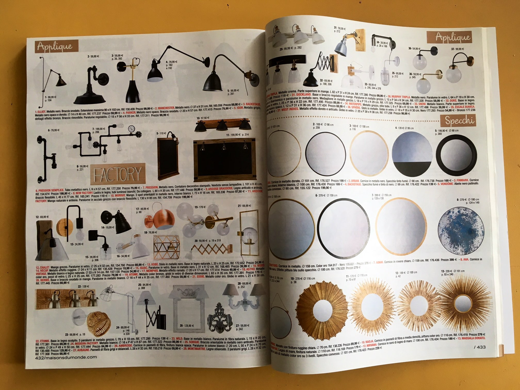
The most important, and not obvious, thing is the quality of the photos: it must be obviously good and especially uniform, that is, all images must have the same quality. Having some images photographed well and others poorly is an attack on the success of the catalog. Better to ask a photographer to take pictures for all products in the same time period, so that their appearance is uniform.
CONCLUSIONS
The catalog is a key product for a company that makes selling or producing products its strength. It can be a B2B or B2C tool, internal or external, sales or presentation tool, it can be handled by those who will have to place large orders or by the buyer who will buy only one product.
So it must be versatile and designed to be able to respond readily to these needs. The way it is done says a lot about the company, more than a brochure or other presentation and communication tools: the catalog represents the company, what it actually does beyond promotional text, advertising content, and its corporate storytelling.
The design of a catalog really tells a lot about how a company works and is organized: you can compare it to a tour inside the offices, the warehouses, the production rooms.
Good companies can have bad catalogs, but poorly organized, inefficient, and careful companies can hardly produce good catalogs.