
Quotations, potpourri of genres, a few fetishes and a lot of extravagance: the characteristics of Quentin Tarantino also definitely find their way into the lettering used in the opening credits of his films. How many other directors would be able to employ four different fonts in a sequence of a few seconds, as happens in Kill Bill? Then there are the homages to the lettering of spaghetti westerns, font borrowings from 1970s B-movies, and certain typefaces that recur in virtually every film.

In short, even typographically, the master of American cinema never seems to bore us. Here you will find a roundup with examples of the most iconic opening credits of Tarantino’s legendary films.
Reservoir Dogs
Reservoir Dogs – Quentin Tarantino’s first film – was made on a shoestring budget, so much so that some actors had to bring their own clothes and car to the scene. Perhaps it is also this that gives the film a peculiar patina, somewhere between homemade and an old cop movie. As can be guessed already from the opening credits.

http://annyas.com/
The protagonists are filmed in slow motion in the now-famous walk, while their names appear on the screen: the font used is the graced Palatine font, in a mustard color that would become a trademark for almost all of Tarantino’s films. A 1970s hit stomps the beat in the background. The film’s title is done in the classic Garamond, another graced typeface-which originated in France in the 16th century and has come down to us with various modifications. In Italy, by the way, it is a “record-breaking” font, as we recounted here.
As the titles run clean and nicely cadenced, the sound suggests that something is changing: the music fades out and strange wails begin to be heard in the background. Do you remember who is in a bad way?
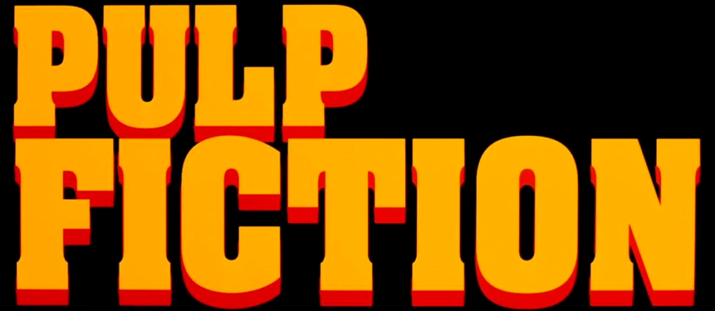
Pulp Fiction
The best known of Quentin Tarantino’s films – Pulp Fiction – kicks off a special partnership between the American director and Pacific Title, a Hollywood company that has specialized since the silent film days in title design. Pacific Title first, and their designer Jay Johnson later, would sign off on the graphic design of titles in all of Tarantino’s subsequent films.

http://annyas.com/
After offering us the definition of pulp according to the American Heritage Dictionary in a classic Times New Roman, he begins an opening sequence that already prepares us for what we will see in the next two hours: street dialogue, bad intentions, and 1970s quotes.
The first credits are in ITC Busorama, a sans serif font designed by Tom Carnase in 1970 that combines art deco with a freaky style. From the bottom, the now iconic film title appears in a very powerful font: the 1969 Aachen Bold. Overlaid in white are the actors’ credits: the font used is in all likelihood the ITC Benguiat modified in the initial letters. This graceful font was created in 1977 by font design master Ed Benguiat and is also used for the logo of a recent TV series, guess which one.
Someone then changes the radio station and-we find ourselves in a Chevrolet with John Travolta and Samuel L. Jackson.
Jackie Brown
Quentin Tarantino’s films are stuffed with quotations: underground films, Italian poliziotteschi, and B-movies. In Jackie Brown – the American director’s third film and probably his least known – everything, even the title lettering, is a grand homage to blaxpoitation films. Blaxpoitation is a genre that originated in the United States in the 1970s that can be roughly summarized as follows: funk music, lots of soul, little budget, and an African-American target audience.

The title of the film is made by accentuating the funky characteristics of ITC Tiffany, another font made by Ed Benguiat in 1974. The main reference is the poster for Foxy Brown, a 1974 blaxpoitation film starring the same leading lady chosen by Tarantino: Pam Grier. Even the typeface used for the Foxy Brown logo is made by the prolific Ed Benguiat: the Benguiat Caslon. No wonder: Ed Benguiat is a long-lived-now 93 years old-and prominent typeface designer who has created more than 600 fonts and many movie title fonts.
Inglourious Basterds
We have seen how often the use of fonts in the opening credits of Quentin Tarantino’s films somehow traces his filmmaking style. And if there is one thing Tarantino loves, it is to appear in his films. His cameos are innumerable: in Pulp Fiction he finds himself in the house of John Travolta and Samuel L. Jackson with a big problem to solve, while in The Hyenas he is part of the gang of thugs.

Somehow even in the opening credits of Inglourious Basterds-the director’s sixth film-there is a cameo by him. In fact, the title of the film is written in his own hand: the image was taken from the cover of his final screenplay, completed in July 2008.
The Hateful Eight
Quentin Tarantino’s two western films offer a tasty opportunity to go dredge up some spaghetti westerns, even from a typeface perspective.

The font used for the title of The Hateful Eight – Quentin Tarantino’s eighth film – was designed Jay Johnson taking inspiration: from hundreds and hundreds of spaghetti westerns! In particular, the title’s almost playful lettering is reminiscent of the creations of Iginio Lardani, the “Sergio Leone” of title design – who signed the genre’s most famous intros. Finally, the actor credits in mustard-colored ITC Bookman remind us-if we hadn’t already guessed-that we are watching a Tarantino film.
Once upon a time in Hollywood
Quentin Tarantino’s latest film is a kind of Hollywood fable, somewhere between homage and nostalgia: there are vintage clothes, vintage cars, vintage posters and, of course, lots and lots of vintage lettering.

One of the film’s most interesting tidbits – for us fans – is definitely the scene in which the Hollywood illuminated signs light up one by one. It is a sequence that gives us thirty seconds of pure immersion in 1960s graphics!
But let’s talk about the opening credits. Once Upon a Time in… Hollywood begins, and we feel right at home when we see the now characteristic fonts: ITC Bookman and ITC Busorama, in mustard color, of course. The title of the film, on the other hand, will make its appearance only in the end credits, as if to seal the end of this modern fairy tale.
So we have seen how the typographic choices in Tarantino’s films are not far removed from his way of filmmaking, a unique and now recognized style that the design of the titles goes some way to complement. There are recurring elements, such as the Bookman and the Busorama. There are fonts that explicitly cite whole aesthetic strands, such as the Western or Jackie Brown’s funky world. There is also a healthy touch of beautiful personalism à la… Tarantino.