
Many cartoonists and aspiring cartoonists turn to Pixartprinting to print their stories or create an appealing portfolio with different styles and artistic sensibilities. Among other things, we live in a time in history when the world’s production has touched unprecedented levels of variety with completely different styles, genres and visions.
But comics are not the same all over the world, just put an issue of Batman and Dylan Dog side by side: the formats, the size of the albums and the pagination are different. This also affects the stories and the way they are told.
In the United States, for example, they are called comics, in Japan they are manga, in Italy comics, and in France and Belgium bande dessinée. Here we will investigate precisely the Franco-Belgian school of comics, which represents one of the largest and most influential markets and industries in Europe.
Saverio tenuta: our guide to learning about French/Belgian comics
How to make a Franco-Belgian-style comic strip, whether you want to create a portfolio to show to publishers or a self-produced comic strip?

An old Italian edition of Blacksad, published in France by Dargaud. The format exactly echoes the French one in a quality hardback. First, it must be understood that at the basis of comics as a medium of expression there are deep structures and visual codes that are reflected in the culture, history and evolution of a given country: they are certainly not granitic rules, but they have nonetheless influenced the way a story is told, the structure of the page and the timing of the tale.
To better understand Franco-Belgian comics, we spoke with Saverio Tenuta, a cartoonist with a long career in France (with forays also in the United States and Italy): he is the author of La Légende des Nuées Écarlates (The Legend of Scarlet Clouds in Italy) and Le Masque de Fudo (in Italy
La maschera di Fudo), published in France by the publisher Les Humanoïdes Associés and in Italy by Magic Press.

The grammar of French comics and the fundamentals of bande dessinée
The premise is very simple: comics are composed of several fundamental parts, which works from all parts of the world share, namely:
- Vignette: is the image drawn in a single unit, which contains drawings and dialogue. Juxtaposed they create a comic strip.
- Cage: is the set of vignettes that create the page and its structure, which becomes the so-called comic strip.
- Closure: literally the “white space” that divides the vignettes and also defines the time of the story.
Having made this premise, let us talk specifically about bande dessinée, which literally means “drawn strip.” In France, especially in realistic products, but also in some examples of humorous bande dessinée, a very particular type of comic strip is in fact required, with attention to detail, with stories that favor adventure and a neat, clean style.
According to Saverio Tenuta: “In France, the union between the author and his character is much more intimate, especially compared to the Italian and American markets: the reader does not untie the author from the character, and rarely is the world created by one author repurposed by another cartoonist. As a result, the processing time is about one book a year, and therefore more care is required for the product, which also shows the author’s strong personality.”
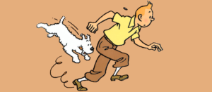
The authors who have influenced and built up Franco-Belgian comics over time are many, impossible to mention them all. Among them is surely the Belgian Hergè with his Tintin, the progenitor of the so-called “ligne claire” (clear line), a crisp and clear graphic style, where every element of the vignette is treated in the same way, that is, only with contour lines that are always closed, with sharp blacks without hatching, in short, without “dirtying.”

Then there was the great Jean Giraud with the Bluberry western series and his “double” Moebius in more experimental stories like The Hermetic Garage and L’Incal. But it also has a great tradition in humor comics, such as the timeless Asterix by René Goscinny and Albert Uderzo.
In short, there are and have been “typical” structures in Franco-Belgian comics, but there have also been those who have completely turned these structures upside down.
The differences: graphics in Franco-Belgian comics.
Having seen some examples that have helped to define its stuile, it is time to understand how a comic book board looks graphically with the Franco-Belgian style as a whole.
In general in comics, the relationships between individual images are more important than the images themselves. The graphic design of the page, that is, the number, position, and size of the vignettes, is really the most important moment in the process.
It is easier, therefore, to understand the Franco-Belgian setting from the differences with other ways of conceiving comics, for example, compared to a panel with an American style. Just look at these two images below: the first panel (left) is from Spider-Man Noir, a noir retelling of Marvel’s famous superhero, while the second is from the French series Cosa Nostra, which recounts events of the American Mafia that really happened at the turn of the 1930s and 1940s.

These two the plates show a scene where the central event is a shootout. What immediately jumps out at you is the profound difference between the setting of the two pages: the first, also complicit in the events narrated, is hyper-dynamic, while the second is very calm, square. Going deeper, one can see that in the first panel the vignettes are “only” five while in the second there are as many as nine, almost twice as many.
In Spider-Man Noir, the central event is put in the middle of the panel, with a larger vignette (the man shooting), without the slightest sort of closure; in fact, the vignettes are juxtaposed to each other in a seamless solution: everything happens in a very few moments.
In the Cosa Nostra panel, on the other hand, we see an ambush on one of the characters in the story: unlike the first panel, here we can see that there is a real “punctuation,” represented by the closure, which punctuates the moments according to the idea of the screenwriter and the cartoonist. The panel begins with a great detail and the patrons are only seen through two other details that best connote the event that is about to happen, without showing them openly.
“For the French one, it’s important the narrative and that everything runs smoothly. The American one, on the other hand, has a more ‘wow’ effect, it has to hit you with big vignettes and then you have the corollary ones, whereas the French one has a very specific sense of reading. The vignettes have to follow each other regularly,” Tenuta told us.
In short, in the Franco-Belgian comic strip, storytelling and narration override spectacularization for its own sake, preferring a well-scored flow of images that accompany the reader through the story.
The Franco-Belgian table and the finished product
The Franco-Belgian school in general has thus codified over time a fairly square cage, consisting of:
- Four strips
- 8 to 12 vignettes per panel
- Stories of 46 plates
This does not detract from the fact that each editor (e.g. Glénat, Delcourt, Dargaud, etc.) and author has “his” cage and his own way of working. In fact, it all depends on the story and what one wants to tell.
That is why there can be boards with three strips, or with fewer vignettes (7, for example) or with a very high number (14-15 vignettes): “What changes in any case are the proportions: the French cage is more square, compared to the American one which is more vertical and long,” Tenuta reiterated.
But how is the drawing sheet structured? Again, there is no universal standard, but in general “there is the cage that delimits the vignettes, then there is the outer margin of the sheet. In addition, there is another cage outside the margin of the sheet, which is then cut off at the printing stage, which is 5-6 millimeters larger than the sheet,” says Tenuta.

Why is there an outer margin on the original board that is cut off at the printing stage? As Tenuta told us it happens because “if the author decides to draw a vignette that goes off the page, that is, that goes all the way to the edge of the page, he should not be forced to draw on the original exactly all the way to the edge of the page, that would be very inconvenient. So the author draws a little beyond that, so he can be sure that in cutting that vignette will go ‘off the page,’ that is, it will come exactly to the edge of the page.”
What format should the French comic be drawn on?
It is definitely not the standard A4, A3, or other such. There are no predefined measurements for drawing in the Franco-Belgian style, so the easiest and quickest way not to make a mistake is to make use of an already published reference book (we did this with Blacksad), take the measurements of the page and bring them back on the drawing sheet (or photocopy the printed page and recalculate the cage), always taking into account the additional margins of the sheet and the cut-out.
If, on the other hand, you prefer to draw “large,” that is, at a larger size than the printed page, simply draw a diagonal within the cage taken from the original page, to maintain the correct proportions.

The finished product is usually printed in a high-quality hardback, with stories generally in color, unlike the comics we see in Italy. The French volume standard measures 24 × 32 cm, with a 46-page story, although different formats have been developed over time (even up to 60 or 80 pages).
As far as printing is concerned, French albums are considered real books, so a hardback with a square spine can be chosen to at least simulate such a product, while to create a portfolio of plates or drawings a rough and milled, or stapled, paperback binding would also be fine.
This concludes this journey inside bande dessinée, a vast and richly varied world: the advice is therefore to read as much as possible about the authors and stories of this great tradition, only in this way can the narrative and technical structures be understood in depth.