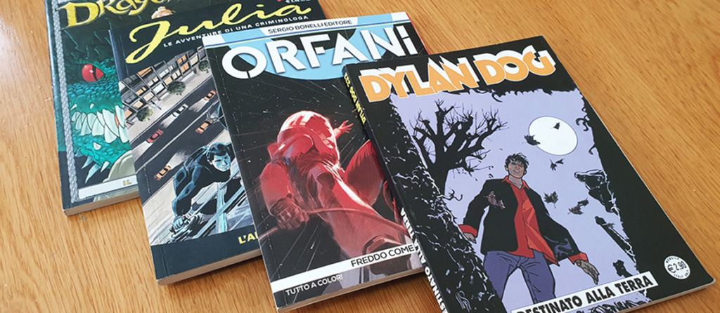
For decades, newsstands have been full of Italian-made comics in the classic “bonellide” format, a term used by insiders to refer to a specific albo format, with page size and type of material that characterizes classic popular Italian comics.
Comics such as Tex, Dylan Dog, Nathan Never and Martin Mystère, published by the Milan-based publishing house Sergio Bonelli Editore itself, have won many readers of all ages, fascinated by these stories that span genres such as westerns, horror and science fiction.
The term bonellid initially had a negative connotation, but over time it gained a neutral connotation, simply indicating a publishing format. Especially after 1986, which marked the great success of Dylan Dog, several publishing projects were born in Italy that used this format, such as the publishing houses Editoriale Aurea and Bugs Comics. Among the most famous it is enough to mention Dago, Lazarus Ledd, Orfani, and the recent Samuel Stern.
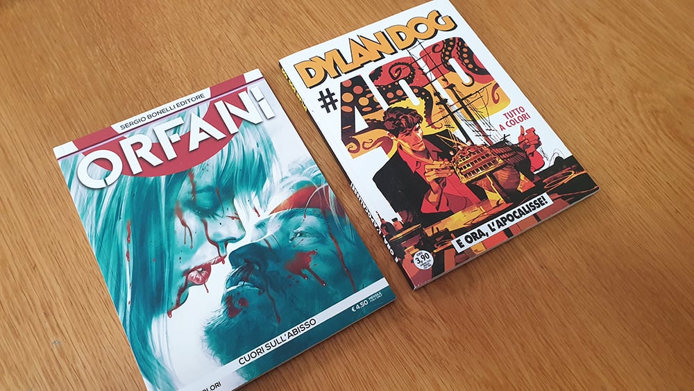
Many aspiring cartoonists and illustrators choose just Pixartprinting to print their stories or create an eye-catching Italian-style portfolio with bonellide format. To do this in the best way, however, one needs to know the specific codes of this publishing format.
Luca Lamberti: our guide to learning about the bonellide format
How, then, to make an Italian-style comic book in the bonellide format? What tricks and rules should be followed if you want to create a portfolio to show to publishers or a self-produced comic that reflects the characteristics of the bonellide?
To find out all the details of this world, we spoke with Luca Lamberti, an author and illustrator who has worked for the Italian market on John Doe and continues on the weekly Skorpio and Lanciostory for Editoriale Aurea. He is also part of the creative team of the Samuel Stern Series, for which he has drawn some issues. In addition to this he is editor and author, together with Leonardo Cantone, of the newsstand Fantasy title to be released in 2022 by Bugs Comics. In the past he has also worked for the American market for IDW Publishing on the Star Trek comics.
Thanks to his tips, we have compiled this guide on how to make comics in the bonellide format.This is a vast subject and one that for many authors requires years of study. This guide therefore does not pretend to be exhaustive, but it is an introduction for those who would like to make their passion a job, or for those interested in better understanding the codes and realization of the Italian and popular vision of comics.
The grammar of Italian popular comics
As we have already seen in the guide in the making of French bande dessinée, each geographical area has one or more ways of understanding the page of a comic strip. At the base, however, there are some key elements that unite all comics, the same all over the world:
- The vignette is the single image drawn
- The cage is the set of vignettes that make up a page or board
- The closure is the “white space” that defines the time of the story.
Speaking specifically about Italian comics, there are so many authors who have created and influenced this way of making comics: reading and studying them can be a first step in understanding how to create such a comic, although it is impossible to mention them all.
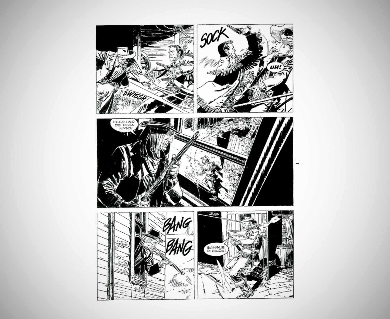
The original imprint is definitely Gian Luigi Bonelli’s Tex, initially drawn by Aurelio Galleppini, created and published from as far back as 1948. Initially Tex is published in strip format, containing a maximum of 3 vignettes per page, all this until 1953. Later it will be published (until today) precisely in the bonellide format.
A Tex panel drawn by Corrado Mastantuono.Regarding more recent authors, Luca Lamberti recommends three:
- Massimo Carnevale: for his grotesque, dirty mark, but of an unparalleled elegance.
- Stefano Andreucci: always speaking of elegance, he is for him the ultimate summa of classic Bonellian drawing. “Many I’m sure would name Claudio Villa for this heavy praise, but as much as his technique is unexceptionable Andreucci’s more characteristic and personal stroke makes me prefer him,” Lamberti told us.
- Corrado Mastantuono: he is the eclectic cartoonist par excellence, going from drawing a realistic Tex (but with an extremely recognizable and personal style) to a Mickey Mouse jumping from one style to another with an ease
The defining elements of the bonellid format
After reading the reference albums and studying the authors, we need to understand the “rules” that characterize this format.
Luca Lamberti explains them to us:
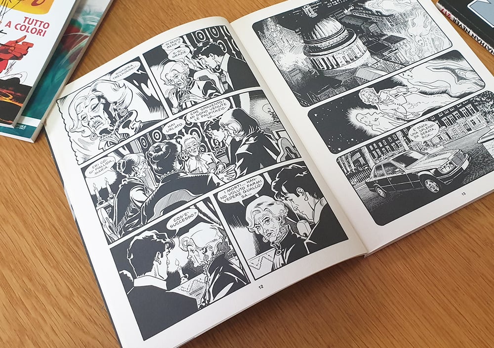
“What has always characterized the ‘bonellide’ format has definitely been its rigidity, which, however, presents a very fluid and well-studied narrative understanding, so as to make it a reference point for an extremely popular audience. The classic Italian comic book board has always been structured in a very square manner, in fact one hardly sees any sbordaturas or splash pages (boards containing a single impact image) that are not enclosed within a box and do not reach the edges of the page, as is usually the case in American comic book boards. The sense of reading is from left to right like all major markets, unlike the Japanese market, which is read from right to left.”
In any case, as the audience has matured, the Bonellian board has also evolved. Lamberti tells us:
“The Bonellian board is approaching a decidedly freer and less ‘square’ type of storytelling, which is not so far from the American style that structures its board on 4 strips, with a decidedly more vertical format, but without a structural limitation regarding the number of vignettes. For example, Bugs Comics particularly embraces this ‘revolution’: although it arrives on newsstands with the format that makes Italian comics recognizable, the illustrators are given total freedom in the structure of the board.”
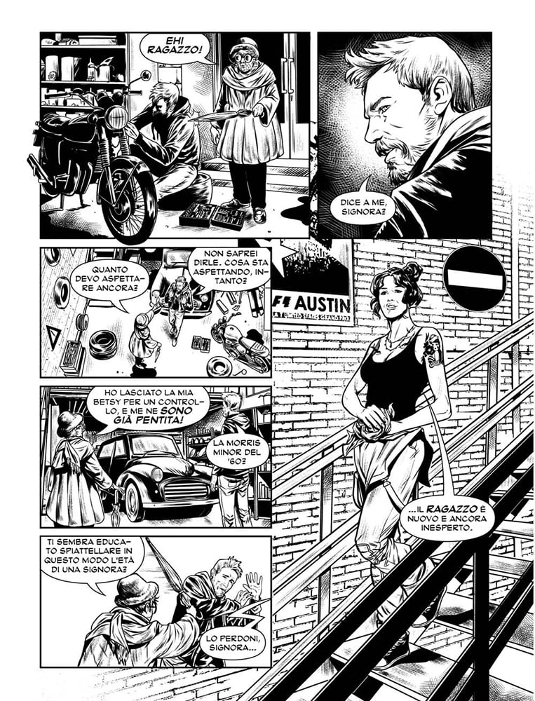
The Bonellian board and the finished product
The Bonellian board is therefore basically very “rigid” and clearly structured, here are all the details:
- It has a format of 16×21 cm and the board is divided into 3 horizontal strips, which in turn can be divided in half vertically, so as to obtain a maximum of 6 vignettes.
- The space between each vignette is usually around 5mm.
- Albums consist of 96 pages, of which 94 are the plates that make up the story. The other two are usually left for the title page and editorial, although lately there has been some experimentation with color. The norm is for the albums to be in black and white.
- The type of binding is always the paperback.
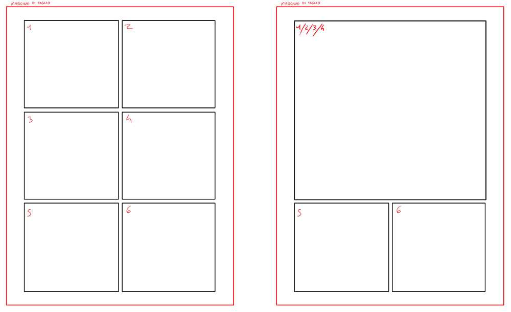
But how is the drawing sheet structured? Above and below are some examples regarding the division of the board into vignettes. Here is how to read these images:
- The black squares (or rectangles) correspond to the edge of the vignettes, which together make up the cage
- The white area between the black rectangles and the red border represents the “outside of the cage,” where the elements that overhang outside the vignettes fit. You can see very little in this format, although in more recent publications more freedom is allowed.
- The red line is the cutting edge at the edge of the page, so where the sheet will be cut when printed.

The finished and printed product in the bonellid format is then a comic book with a size of 16×21 cm, paperback and usually in black and white. At Pixartprinting you can choose, for example, unsewn and milled paperback binding.
This concludes this journey inside Italian comics, a world full of authors, stories and comics to discover.

