

The store sign: what is it and what is it for?
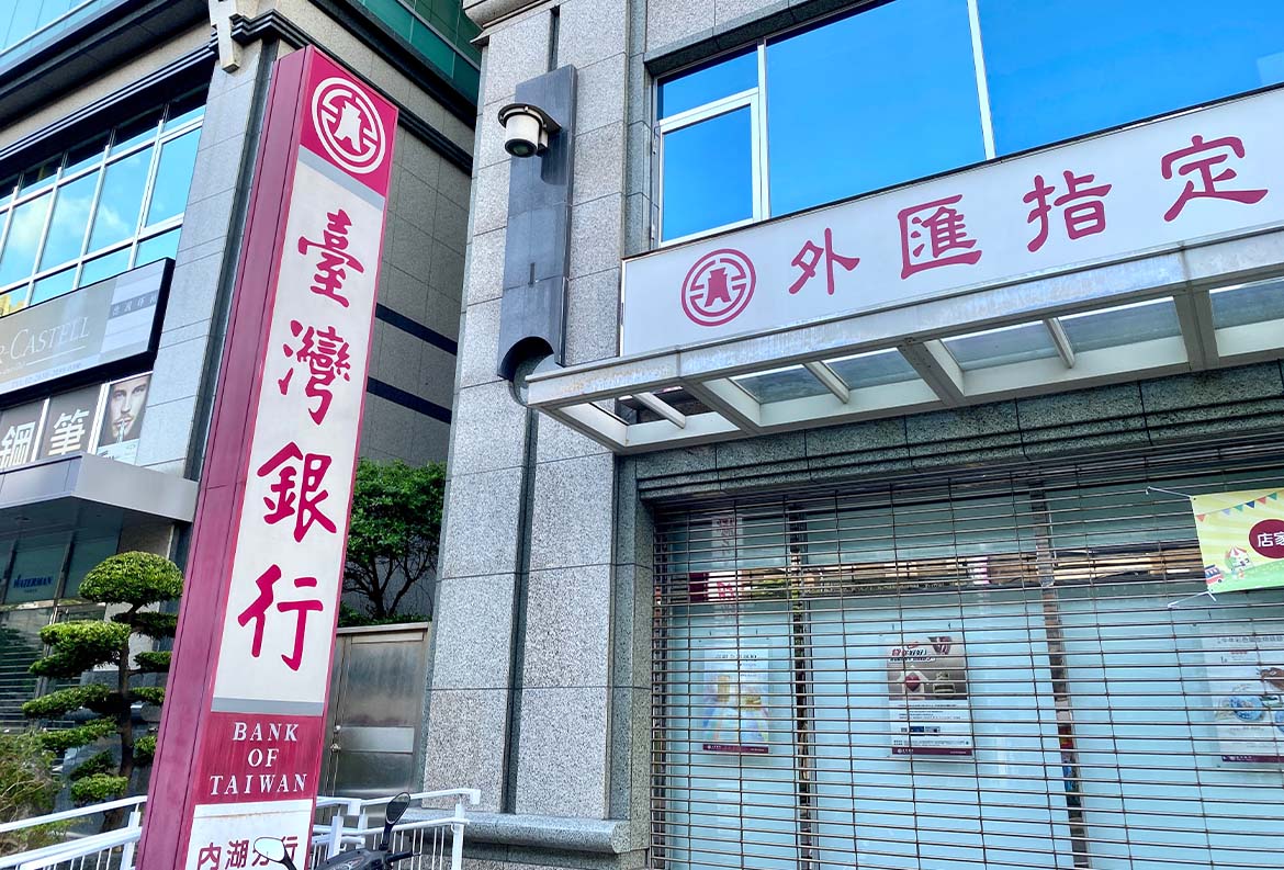
The sign is, quite simply, the inscription that indicates the presence of a business. It is, therefore, also a tool for advertising itself and attracting potential customers. To be highly visible, it is usually placed high above the entrance to the business and bears the store’s logo. Just the logo? Well, it depends: in case the logo or name is not didactic or well known enough, the indication of the type of business may also be present. An example? The ironing shop “Marisa&Paolo” could have a sign with the name and logo of “Marisa&Paolo” accompanied by the specification: “Ironing Shop.”
But to better understand what a sign looks like, let’s look at some examples.
Ideas and examples of store signs
Signs are divided into two broad categories that differ in price and degree of visibility.
Illuminated signs
These are signs with built-in lighting that increases their visibility even at night, or in busy squares or streets-if, for example, the store is located near a large intersection, a bright sign can help it stand out amidst the confusion. The classic example is the pharmacy cross, visible even from a distance and in the middle of the night.

Obviously, such a sign costs more than a non-illuminated panel because it is more complex to make.
But now let’s take a walk through the main types of illuminated signs that we can encounter in our cities, because there are so many of them.
Illuminated dumpsters
These are panels equipped with internal LED lighting. The main advantage? They are highly visible, even from a distance.

Illuminated letters
They can be made of aluminum, steel or plastic, and there is LED lighting inside them that makes them visible even at night. We like them because they have a retro feel.

Backlit signs
They are illuminated by LEDs placed on the back. The rendering is very elegant as the sign is enveloped in a halo of soft light.

Illuminated totems
These are vertical signs lit from the inside that are placed on the ground near the entrance of the store. Pros: they provide great visibility as they go out to people walking along the sidewalk-it’s really impossible not to notice them! Cons: they require a lot of space to be installed. Also: they cannot replace the classic sign placed high above the store entrance, as totems are not very visible from a distance.
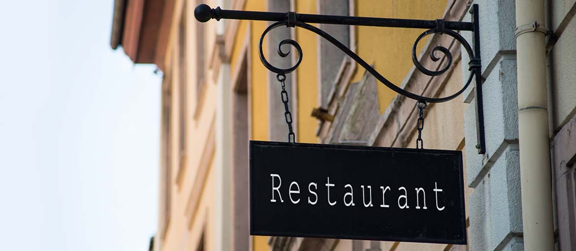
Non-illuminated signs
These are signs that do not have an integrated lighting system and usually have lower implementation prices. They do not guarantee you the same degree of visibility as an illuminated sign, but if your store is well lit, then you may consider it. There are really so many solutions to choose from, here we show you a few.
There is the sign printed on a hardboard (forex, plexiglass, aluminum or polyboard), which gives you a very wide range of customization options.

If you want to give your business a retro flavor, there are the engraved signs: on marble slab or wooden panel.

Or you can choose a wrought-iron flag sign, as is customary in France.
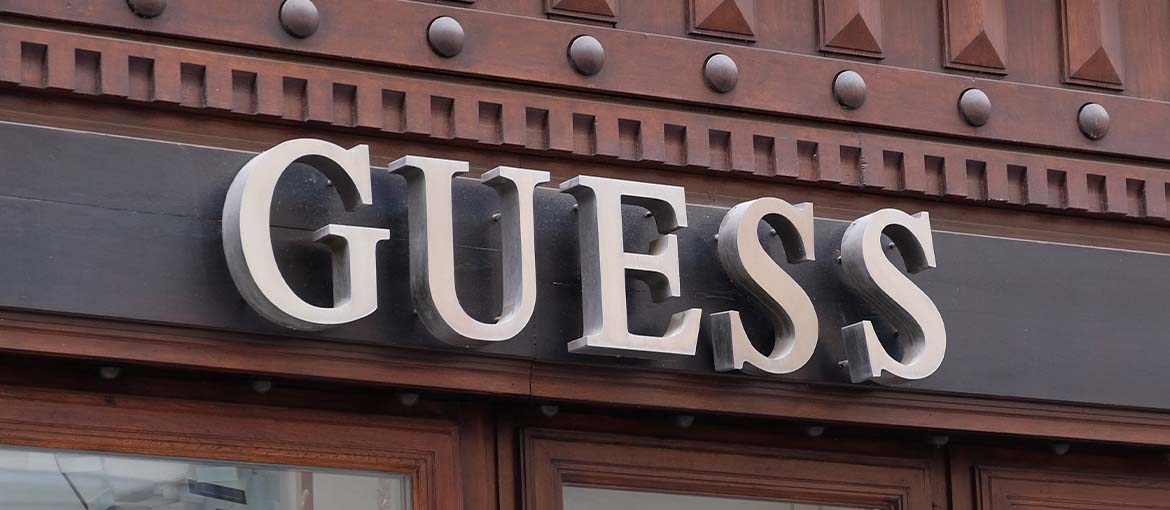
Want to give the sign great prominence and make it highly visible even from a distance? Opt for a three-dimensional sign, with characters or logos made in relief. The workmanship is, in this case, more challenging and the costs increase.
Speaking of cost, the question arises.
How much does a sign cost?
The answer, as is often the case, is “it depends.”
- It depends on the type you choose. We have already seen, for example, that illuminated or three-dimensional signs cost more than simple printed panels.
- It depends on the cost of the professional to whom you will entrust the work.
- It depends on the cost of the tax to be paid to the municipality.
On this last point, things are clear, as they are regulated by Law No. 75 of April 24, 2002: the installation fee “is not due for signs for the operation of commercial activities and the production of goods or services that distinguish the location where the activity to which they refer is carried out for the total area up to 5 square meters.” Translated: if the sign does not exceed 5 square meters in area, you will not have to pay any tax. If larger, you will have to pay an installation fee that varies according to its size.
What to do to display your own sign?
You have to dialogue with the municipality to obtain permission. So before you draw up a plan, we recommend that you check with the city planning office to see if, in your neighborhood, there are regulations to be followed regarding the appearance and size of signs.
Once this is done, you can apply. What documents need to be submitted to the municipality?
- the design for the sign;
- a completed form;
- the permit application.
Then you will have to wait for approval. And, in case it is late in coming, you can always display a temporary sign for 90 days.
Since we’ve talked about designs, let’s close by leaving you with tips for choosing a functional sign that can speak volumes about your business.
Tips for designing an effective sign
Recognizability, clarity, visibility. We said these are the watchwords. Here are a few tips for working on these aspects.
For a recognizable sign:
- Respect the brand identity, so use fonts and colors that are part of its visual identity.
- Think about the target audience: the sign must speak to your potential customers.
- Respect the style of the store and (possibly) the architectural style of the building in which it is installed-particular attention should be paid to businesses located in historic centers.
- Study the competition: it is useful to realize, at a glance, whether there are aesthetic parameters to be respected in the neighborhood, but also to understand how to differentiate yourself and work on your uniqueness.
For a clear and readable sign:
- Focus on a few elements or you risk confusion.
- Study font size and thickness and kerning. The text should be readable at a distance, in low light and by people looking at it quickly as they pass by on a scooter or in a car. Be careful, however, not to “shout”: mammoth fonts may look unattractive.
- Choose a good color contrast between font and background, capable of making the logo or store name stand out.
Now that you are clearer on everything that needs to be done: off to the project!