The @, snail or a commercial, now found on every keyboard and universally recognized as an e-mail symbol, until only a few decades ago was a fairly unusual glyph, familiar only to accountants. But how did this curiously shaped symbol come about? And how did it become the emblem of a new way of understanding communication? We have reconstructed the history of this symbol, which is so modern but has surprisingly ancient origins.
Origins and history of the symbol
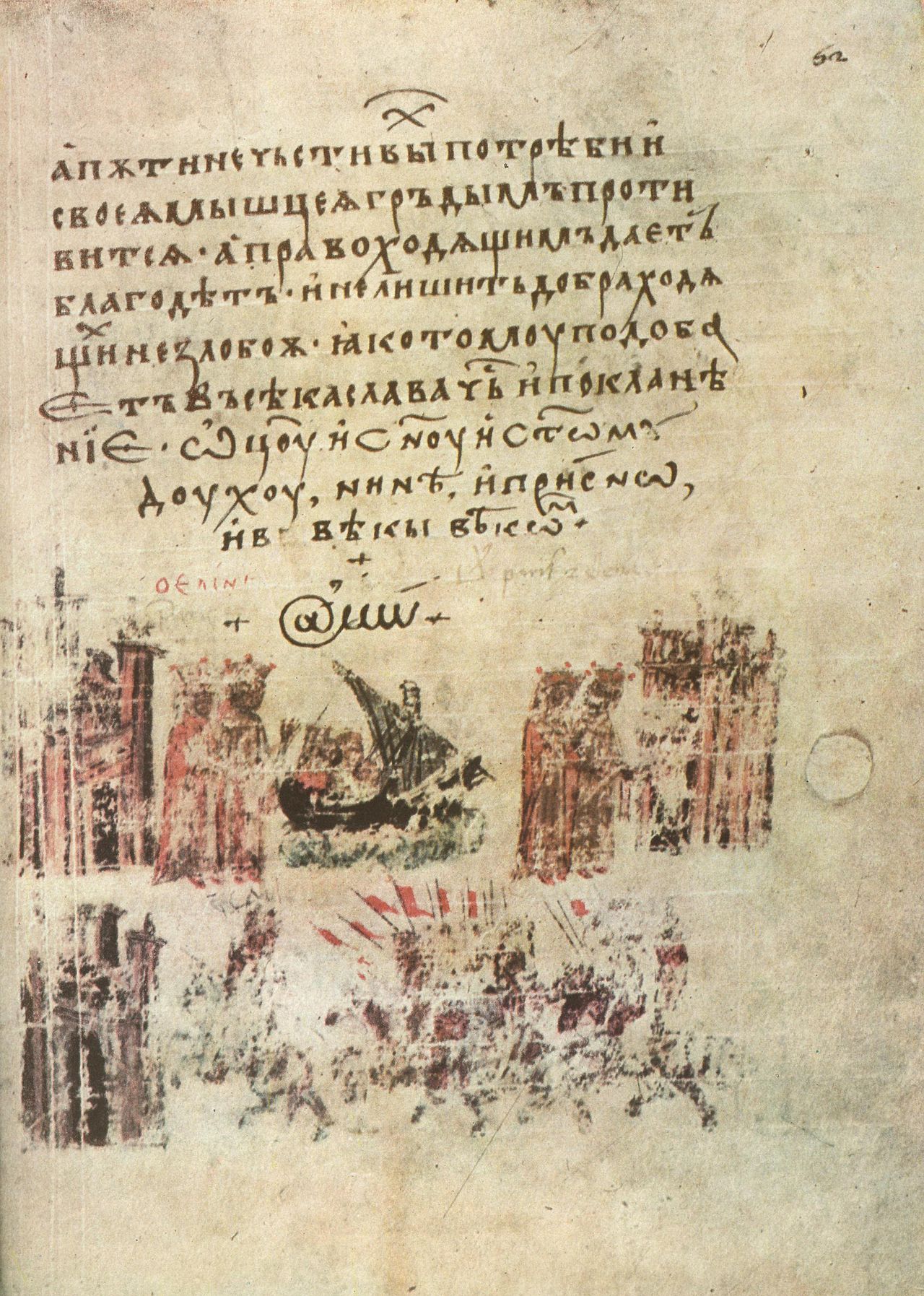
The origins of the symbol are shrouded in mystery. It was first found in the religious sphere, in a Bulgarian translation of a Greek chronicle from 1345. The handwritten document, now kept in the Vatican Apostolic Library, shows the symbol @ in place of a capital A in the word Amen. However, it remains a mystery as to why it was adopted in this context.

According to one theory, the @ originated within abbeys, where monks, intent on transcribing copy after copy of manuscripts and always on the lookout for abbreviations, may have converted the Latin expression “ad” (“up to”) into an “a” joined to the end of a “d,” like a tail. But there is also speculation that it might have been a way to speed up the writing of the French word “à” (“to”) without detaching the nib from the parchment.
In a 1536 letter from Francesco Lapi, a Florentine merchant, the @ is used to refer to units of wine, amphorae. This is the first in a long series of examples where the @ is used as a symbol to indicate a unit of measurement. In fact, in Spanish and Portuguese it is equivalent to the abbreviation for the unit of weight arroba, derived from the Arabic “a quarter” (الربع pronounced ar-rubʿ).
In the Anglo-Saxon world the symbol later took on a commercial significance, meaning “at the price per unit of.” However, being linked to a still rather sectoral use, the first typewriters, produced since the mid-19th century, did not include it. It was instead included in 1961 in IBM’s Selectric to indicate the price per unit.
The @ enters modernity
What completely changed the history of the @ and decreed its future fame was programmer Ray Tomlinson, recognized as the inventor of email. In 1971, faced with the need to choose a glyph to use between the user name and the destination address in order to send a message created by one user and destined for another via the Arpanet, Tomlinson chose the @, as it was sparsely used in programming up to that time. The choice is particularly apt, since @ in English is read as “at” (“a,” motion to place).

Uses of the @ symbol
As previously indicated, in English the @ is still used in business context to indicate price, although it is not an accepted usage in standard typography. The use in the context of email addresses is certainly the most commonly recognized nowadays.
Increasingly common is its use within blogging platforms, forums, and social networks, to indicate usernames (e.g., @mariorossi), and it is often used in responses to a specific user, or to call his or her attention.
In English, the @ is often used as a synonym for “at” to indicate the location of events.
Interesting facts about the design of the @
Since the origin of the @ is not ascertained, it is difficult to trace a history of the evolution of its design. It is only since a few decades, in fact, that it has been included in every typeface and therefore its design has been progressively formalized.
The most common design is certainly characterized by an “a” with a straight vertical shaft, even when the typeface includes a “drop” letter “a” surrounded by the circular extension of the shaft. The choice of the “a” with a straight vertical shaft allows for greater legibility and clarity for less space. Less common are other designs involving an “a” with a drop terminal, or even capital “A” in very rare cases.


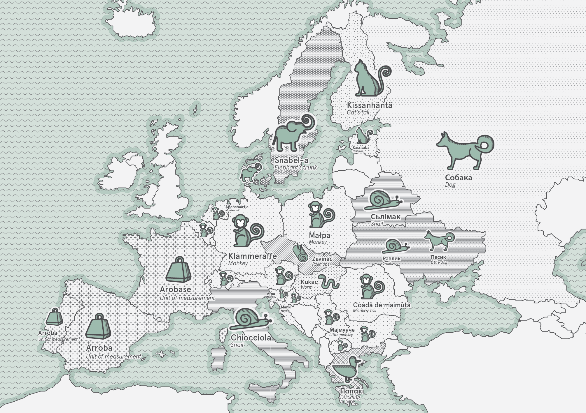
If in English the “@” symbol is known simply by the didactic “at sign,” in the rest of the world one loses count of the metaphors used to define it, from a wide variety of animals and parts of their bodies to local dishes and foods. The common name in Italian is in fact chiocciola (less common is “a commercial,” and it is shared by Hebrew (shablul), Ukrainian (ravlyk) and Welsh (malwen). In these three languages, too, in fact, the symbol is associated with the funny little animal.
Journey through the different Names assigned to the @ around the world
Greeks see in it a duck (papaki), Swedes and Danes an elephant trunk (snabel-a). Several languages refer to the monkey and its twisted tail (apestaart in Dutch, Affenschwanz in German, malpa in Polish, maymunsko a in Bulgarian), others to the dog (soba[ch]ka in Russian), cat (Kissanhäntä in Finnish and kassisaba in Estonian) or mouse (xiao lao-shu in Mandarin), while in Hungarian (kukac) and Thai (yiukyiu) it is a worm. In Czech it is a rolled herring (Zavináč) and in Bulgarian it is sometimes called banitsa, a rolled paste.

The acquisition of the symbol at the prestigious MoMA.
The value in communicative and cultural terms of the “@” in our society is such that MoMA’s Department of Architecture and Design acquired the symbol in its collection in 2010. The importance of this symbol lies not only in the technological revolution of which it is a perfect emblem, but also in the elegance and appropriateness of its choice. Instead of inventing a new typeface, Tomlinson cleverly appropriates and finds a new use for an already present typeface with ancient and underused origins, establishing new rules and new meanings for it. In doing so, the snail has become an expression of new forms of behavior and relationships in an ever-changing world.
The history of the snail is unique, but it is not the only ancient symbol, whose history is lost in the centuries, dusted off to define new interactions in the world of digital communication. There are other curious examples of symbols reborn thanks to the world of the Web.
Get ready and sharpen your eyes!

