
Within the German Bauhaus school, ideas from art and design movements were explored and combined, and then applied to problems of functional design and machinery production. Twentieth-century furniture, architecture, product design and graphic production were largely influenced by the work of students and professors at this school.
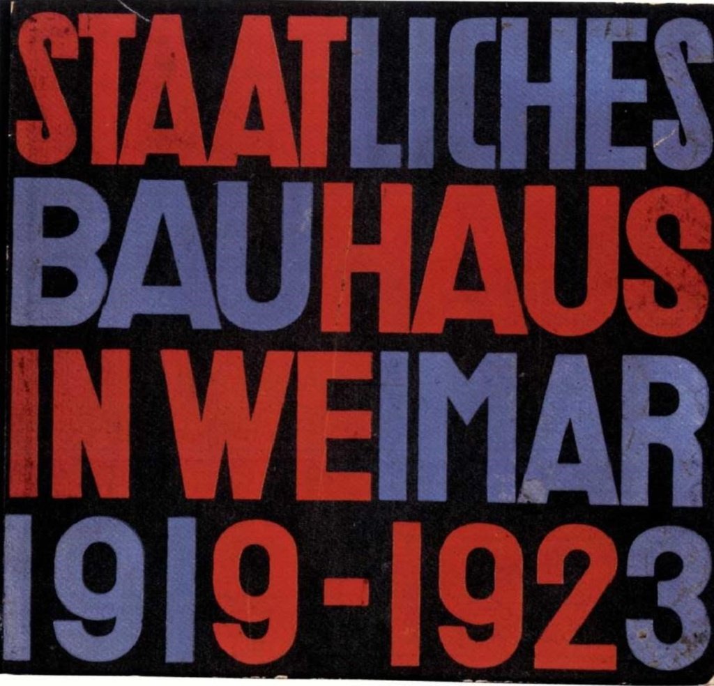
With the end of World War I and the establishment of the Weimar Republic, the Weimar School of Applied Arts and the Weimar Academy of Fine Arts were merged in 1919, creating Das Staatliche Bauhaus, under the leadership of architect Walter Gropius.
The school’s manifesto, published in German newspapers, promoted an idea of art and technology combined for the purpose of solving visual design problems created by industrialization. The metaphor was that of a cathedral as the goal of all visual arts: “[…] architects, painters and sculptors must learn from scratch the composite characteristic of the building as an entity […].”
This school was active in three German cities: in Weimar from 1919 to 1925, in Dessau from 1925 to 1932, and in Berlin from 1932 to 1933. The Dessau phase, under the rectorate of Walter Gropius, represents the highest expression of Bauhaus values and philosophy.
Herbert Bayer’s workshop
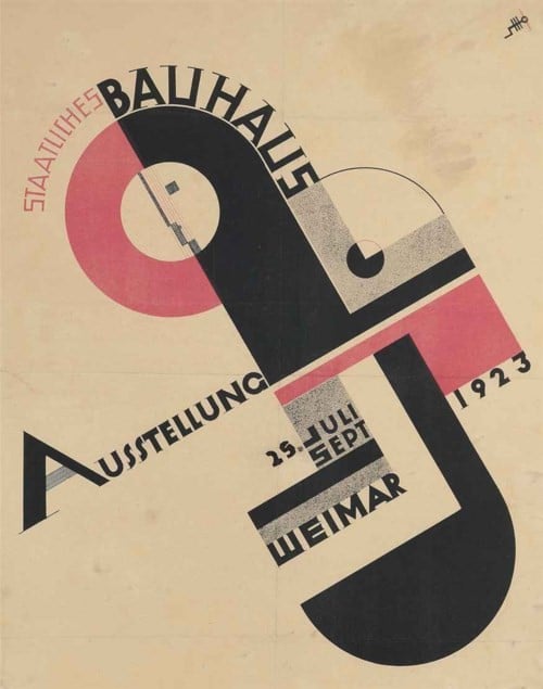
Herbert Bayer was a student at the Bauhaus in Weimar, and collaborated with his professor Lazo Moholy-Nagy on several occasions. One of his first products focused on typography was the catalog cover for the school’s 1923 exhibition.
Following pressure from the Weimar government, and the relocation of the Bauhaus to the small provincial town of Dessau, Bayer was appointed professor. With the curriculum reform, a typography and graphic design workshop was introduced, of which Bayer became the head.
Printed artifacts were produced within the workshop for companies in Dessau in order to finance part of the school’s costs. In addition to this, Bayer’s course introduced constructivist and functional design innovations.
Almost exclusively sans-serif typefaces were used, and Bayer experimented with geometric and strict typographic compositions. Text was often justified, filling columns with wider spaces between letters or words. More contrast between text size so as to establish visual hierarchy. Lines, bars, circles, and squares were used to divide space, and guide the viewer’s eye through the composition. Strong use of elemental shapes and few colors, including black, which was always present.
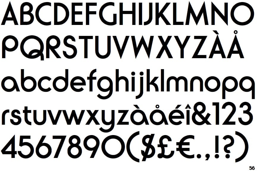
A “universal” font
In 1925 Walter Gropius commissioned Bayer to design a typeface to be used for all official Bauhaus communications. Following the functionalist approach, Bayer designed an “idealist font.”
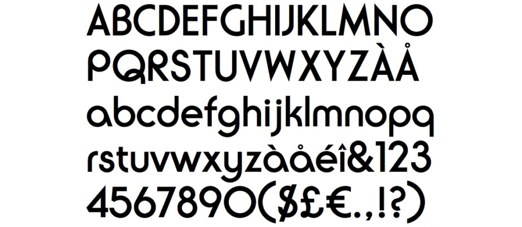
The typeface, called Universal Character, is a geometric sans-serif. According to Bayer, not only was the contribution of graces not necessary, but neither was the existence of capital letters. In fact, the typeface contemplates only lowercase letters.
This typeface was appreciated by Gropius, as it contained the essence of the principles of Bauhuas. Universal is indeed a clear example of the dogma “form following function,” and through the elimination of uppercase letters it marked a breaking point with a tradition hundreds of years long.
The Evolution of the Universal Character
Although it represented the most distinctive Bauhaus aesthetic in typography, the typeface designed by Bayer was never widely used. Bayer’s highest point of typographic maturity within the Bauhaus occurred in 1926 with the design of a poster for a Kandinsky exhibition, and in 1927 with the poster for an exhibition of applied arts in Europe.
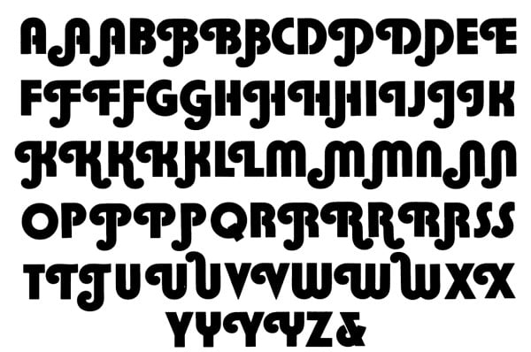

Burko Font
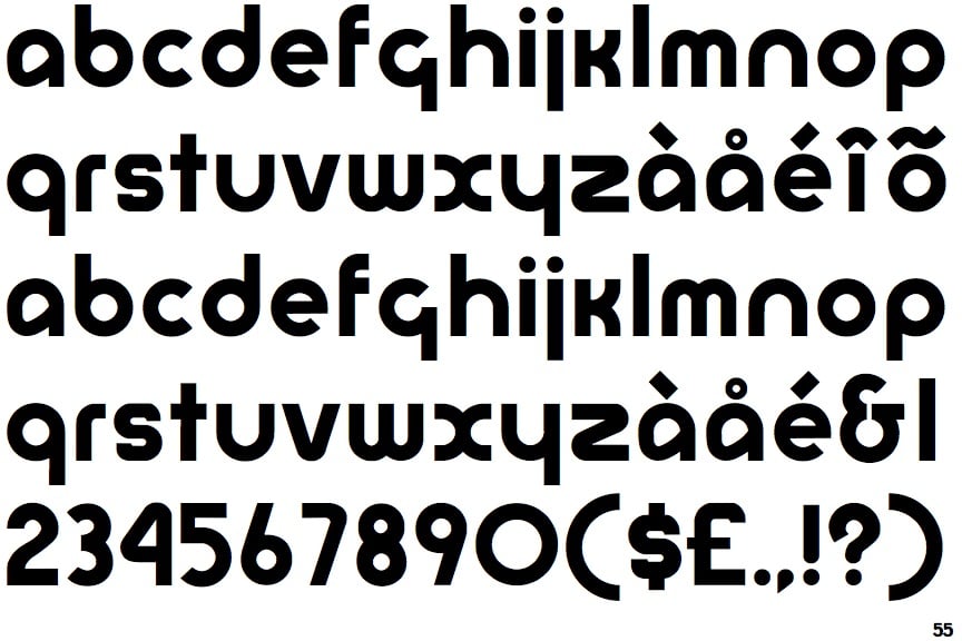
The font designed by Bayer has since been taken up on several occasions. In 1967, David L. Burke took inspiration from the Universal Font to design Burko. Joe Taylor in 1969 would design a bold format version of Burko, renaming it Blippo.
The following year, famed designer and typographer Herb Lubalin, would design ITC Ronda, very similar to the fonts mentioned above, but with the addition of the lowercase alphabet.
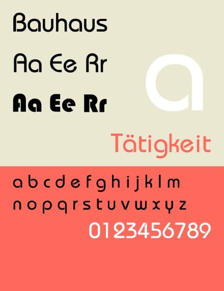
A new experimentation was implemented in 1975 by Ed Benguiat and Victor Caruso, with the creation of the ITC Bauhaus font. This more closely echoes the geometric shapes of Bayer’s typeface, but includes both lowercase and uppercase letters.
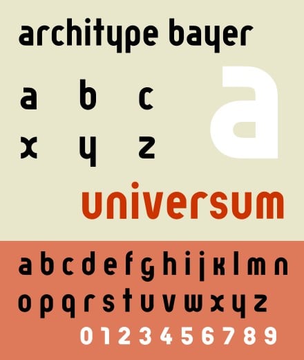
The latest work done on the Bayer typeface is Architype Bayer, a font created in 1997 by Freda Sack and David Quay of The Foundry. Architype Bayer is an interpretation of the original typeface, but it contains only lowercase letters.
Impact on contemporary design
Herbert Bayer was the designer who most expressed Bauhaus values in typography. The Universal Font represents an interesting experiment that takes these values to extremes and brings function to the forefront over form.
Although Bayer was the only figure within the Bauhaus with a long involvement in typography, his work shows little calligraphic or historical sensitivity to letter design and text management. Jan Tschichold, who was in close contact with Bauhaus professors and students, would take up some of Bayer’s principles to produce the famous article The New Typography.
Bayer’s typeface thus now turns out to be only an idealistic experiment. The work of graphic designers during the last century who reworked the Universal Font shows how it became only an aesthetic inspiration, losing its original function.