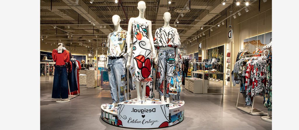
Emotions play a crucial role in purchasing decisions, this is also confirmed by several scientific studies.This means that in the retail world of any merchandise category, from clothing stores to supermarkets, from shoe stores to those who also offer services such as a hair salon, the way you present your storefront, products and point of sale will influence the actions of potential customers.
How to succeed in capturing, captivating and ultimately driving purchase? Visual merchandising is the answer. Literally, it can be translated as “display of merchandise,” but its deeper meaning covers a series of operations more complex than simply displaying products.
In this article we will look in detail at what Visual Merchandising is and its meaning, basic principles, useful products for its organization, and tips for having a good effect through DIY.
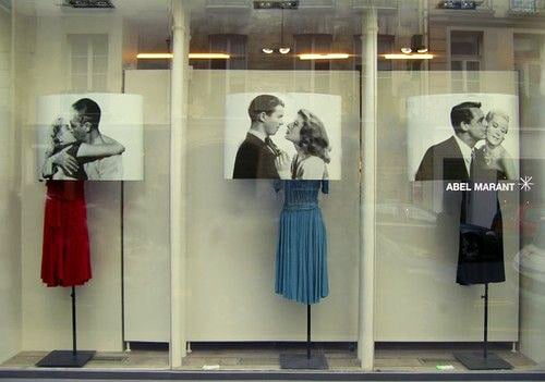
Visual Merchandising: meaning and benefits
Visual Merchandising is an applied retail practice of strategically designing and arranging elements in the store to generate an emotionally and sensory appealing environment.

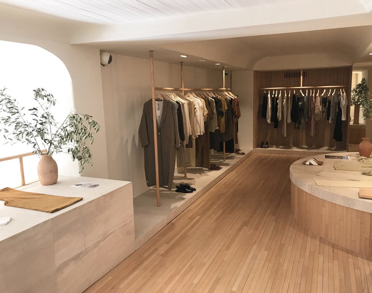
The store is then set up to create an atmosphere in line with the brand’s identity and values and, above all, to attract the buyer’s attention. It contributes greatly to the first impression that customers make by first looking at the storefront, then exploring the interior of the store.
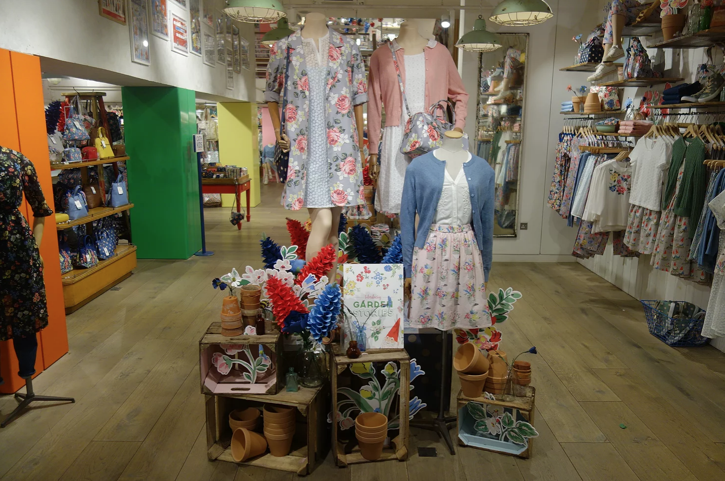
David Anthony Creative
When designing a good Visual Merchandising strategy, a few key elements must be considered:
- All products must be in order and well presented
- You need to show a wide range of items
- At the same time, do not necessarily fill all spaces so as not to create an overpowering environment
- Create an exciting atmosphere for the customer that will prompt them to return
To apply all of this, one can take advantage of the 5 senses of the human being:
- Sight: it is the first sense that is activated in the consumer. One must follow the simple rule “what you can’t see, you don’t buy.” Therefore, merchandise can be displayed creatively, following color schemes in accordance with each other or telling a story, for example, according to the season of the
- Hearing: particular music or sounds are often chosen inside stores to stimulate purchase, but they must always be in line with the brand’s philosophy.
- Smell: the use of particular fragrances can stimulate consumers’ memories, who are then driven unconsciously to the ‘
- Touch: all merchandise should be touched and tried on by consumers, who can then realize the characteristics of what they are buying.
- Taste: many retail establishments offer tastings, to bring the product closer to the buyer.
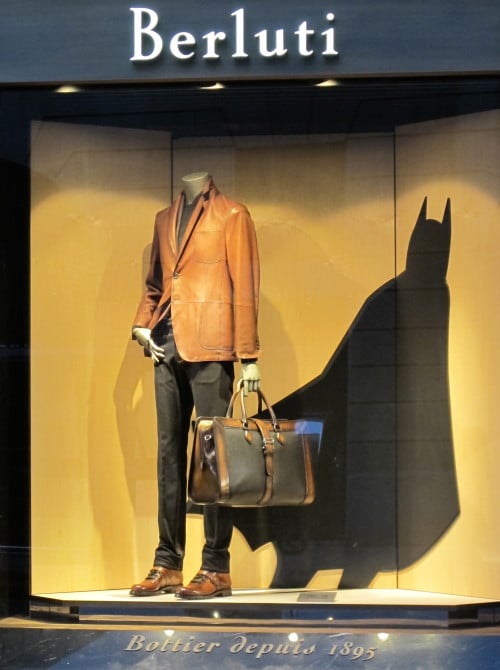
The great value that a proper Visual Merchandising strategy can bring is the ability to engage and inspire one’s customers, consequently pushing them to purchase certain products.
Visual Merchandising: the basic principles
Visual Merchandising is about selling more: the goal is very clear, but execution requires knowledge of some basic rules that if followed will succeed in increasing the average receipt.
Here are 5:
1.Start with the target audience: when you need to set up a store there are some basic questions to ask yourself. Who is one’s ideal customer? What is their average age and lifestyle? Most importantly: what story do you want to tell? Once you have identified the answers, you can decide whether to give a contemporary, classic, more individualistic or vintage character to your store.
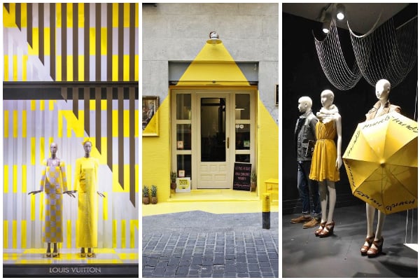
2.The importance of colors: it is essential to have good color coordination. Inside the store or for the storefront you can consider contrasting colors such as white or black, or create some areas of the store with monochromatic colors (for example, yellow, which is the first color perceived by the retina). It must be remembered that the customer directs his or her course according to what he or she sees. So with colors you can create real “paths” to unconsciously guide people inside the store. Today in any case, it is crucial that the store be “Instagrammable,” that is, a place with an atmosphere that inspires potential customers to photograph/photograph themselves inside it, to be shared on social.
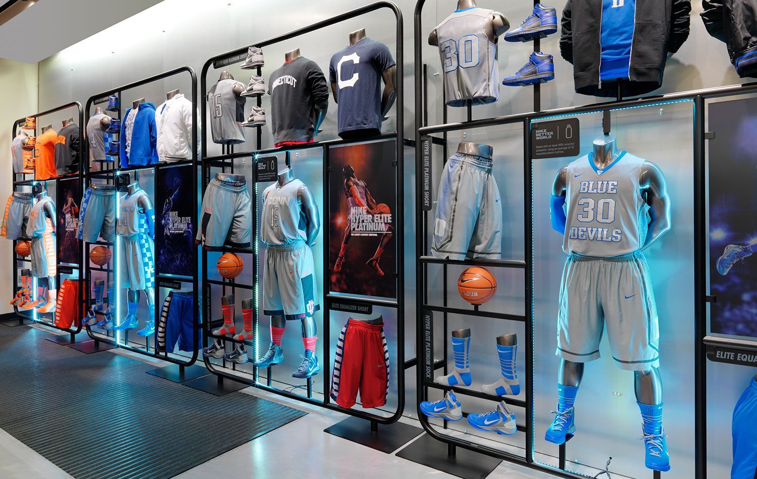
3.Create a strong focal point: The goal is to try as much as possible not to confuse the customer as soon as he enters the store. Where, therefore, should your attention be focused? This requires creating a so-called focal point in each area of the store. It is often placed in the center of a store or on the sides. Or a composition can be created according to the season, but care must be taken to focus on the products and not on the outline being shown.
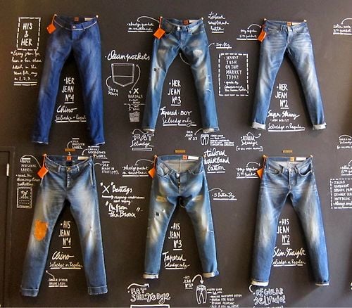
4.Tell a story: inside the store first, clear and concise signage should always be used. Customers need to know at a glance where they need to go to get to a specific area of interest to them. In addition to this, signage can be used for the products themselves: for example, a bulleted list can be presented that explains to customers why they need the product or how their lives will become easier with that purchase. In this way you can quickly tell a real story, helping the customer better understand the product. Beyond words, you can also use specific images and graphics to tell a story.
5.He who sees, buys: a well-designed store exposes the customer to as much merchandise as possible, organized of course tastefully and avoiding unnecessary overabundance to the eye. Many use a circular layout for their store, because that way the customer is exposed to more merchandise. In any case, it is recommended to have as many displays as possible according to the space available, obviously always clean and neat, perhaps positioning the merchandise, organizing it by color or type.
In addition, there is a space that is rarely used in retail outlets: the space between the merchandise and the ceiling. In this case, you can use signs with the clearest possible signage, or art installations in line with the merchandise for sale.
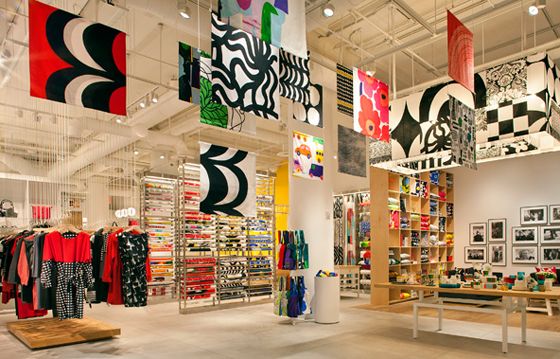
Visual Merchandising: useful materials and do-it-yourself tips
When making the various Visual Merchandising techniques, it is useful to make use of a whole range of useful materials. Here are some tips on the materials to use to set up the store in the best possible way.
The exterior and the storefront
The customer’s first impact with the store is from the outside, so window dressing is a key element in one’s Visual Merchandising strategy. Everything from the lighting to the type of mannequins (if there are any) to digital devices such as displays of varying sizes should attract the customer within seconds and prompt them to enter the store.
For example, the display of products in the window can be customized with cardboard lettering or semi-transparent PVC stickers, which can also be changed according to the time of year. Outdoor displays, on the other hand, can be an extra way to attract the attention of passersby: you are spoiled for choice in terms of customization. Finally, to emphasize special offers during certain periods, window decals and cardboard templates are ideal for organizing a sales display.
Entrance and flooring
Given that most people turn right once in the store, you can still guide them in the best path to expose them to as many products as possible. This is where walkable floor stickers definitely help in one’s Visual Merchandising strategy, which can be leveraged as signage or to highlight special promotions. To keep up with the times, there are also floor stickers to enforce customer distances.
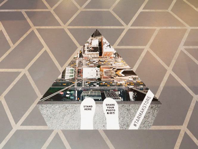
Personalized signage
The customer should never feel confused inside the store. A number of products come to the rescue, such as high-definition printed signs, Forex signs to set up a sign or plaques to provide all useful information to those navigating within the set-up space.
Interior layout
The organization of the store’s interior space has an important influence on purchasing decisions, as well as defining the overall atmosphere. The goal is to take customers on a journey of discovery of its products. For example, one can organize the interior space in a grid pattern, used mostly by supermarkets, which maximizes the amount of products that can be displayed.
Then there is the ideal organization for narrow retail spaces, with displays showing products left and right.

The “loop” organization, on the other hand, actually guides customers on a path to the various environments, as seen at IKEA, in an experience that aims to inspire and drives impulse buying. Finally, there is the free arrangement of displays and products, which inspires customers to wander around the store-this can certainly be the most creative layout, as it can be adapted and changed throughout the year. Attractive products include shelf displays, which can create important focal points within the store, or there are other types of displays in many different formats.
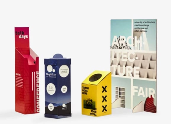
Every nook and cranny of the store can be exploited to communicate something: so you can use particular high-quality posters, or large-format stickers, but also wallpaper that can cover larger spaces.
In short, Visual Merchandising is a world waiting to be discovered, and it certainly does not end with just positioning products in the store in the best possible way. It requires a continuous study of one’s space and current trends, a high dose of creativity and, above all, a lot of passion-this can make any store truly irresistible.

