
Few directors have a style as instantly recognizable as Wes Anderson. All it takes is an extremely symmetrical shot, a particular camera movement or a certain color palette to make us immediately exclaim: This is Wes Anderson!
But the American director, now with a career of more than twenty years behind him, has also earned his fame for another reason: somewhat like the books we read as children, Wes Anderson has the incredible ability to teleport us into fantasy worlds that are so believable and consistent that they seem real to us. Whether it’s whole imaginary nations, wacky boats or retro-futuristic cities – every detail is always meticulously cared for, from clothes to everyday objects, passing of course through typefaces.
This is precisely why today’s article on fonts and cinema is dedicated to Wes Anderson and the typographic curiosities we uncovered in his best feature films!
The Tenenbaums
The Tenenbaums, released in 2001, is the film that introduced Wes Anderson to the general public. It tells of a dysfunctional family and is a compendium of all the elements that define the Texas director’s unmistakable style: strong imagery, manic attention to framing, symmetries, overbearing zooms. And, of course, a certain font as well. Indeed, Wes Anderson has a declared passion for Futura, so much so that he has used it in almost all his films and shorts.
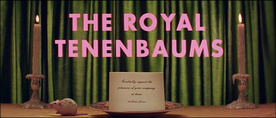
Futura on the other hand is one of the most highly regarded typefaces in the world. It is a modern, functional and strongly geometric font, inspired by the visual elements of Bauhaus although not directly associated with that school. It was designed by German Paul Renner in 1927, initially for use within the Neues Frankfurt (Italian for New Frankfurt), a modernist architectural project that affected the German city in the late 1920s. From that point on, its fame became unstoppable, so much so that it made it to the moon: in fact, it can be found on the plaque affixed to our satellite to celebrate the 1969 moon landing.
Italians will recognize the font in the logo of RAI, the country’s public television station, and in the signage of the national railroad company.
Moonrise kingdom
A great filmmaker also knows when to abandon his fetishes, and how to do it well. So on his seventh feature film, Moonrise Kingdom released in 2012, Wes Anderson abandoned Futura, the font that had accompanied him up to that point. Instead, to design the titles of this fairy-tale teenage romance – Anderson himself admitted that it was the story he had always dreamed of at that age – the director relies on lettering artist Jessica Hische.
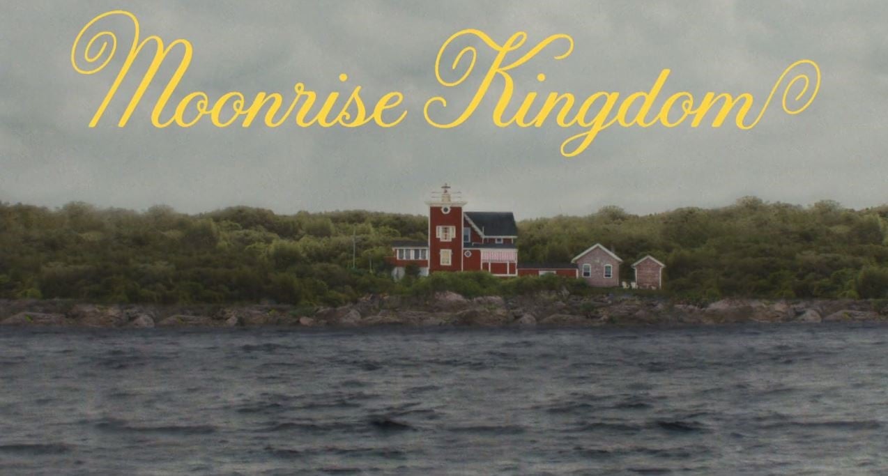
Inspiring the artist in particular is the lettering of an old New Wave film, La Femme Infidèle, released in 1969 and directed by Claude Chabrol. It was one of the references suggested by Wes Anderson himself, but it was still necessary to give the title the right Sixties America touch, more suited to the quiet American provincial aesthetic imagery recreated in the film. After several suggestions to the meticulous director, the result is an elegant, sweet and naive lettering that becomes a distinctive typeface of the film – playfully used in different bright colors in the opening and closing credits.
A great result also because it was the first time the lettering artist had tried her hand at creating lettering and then an entire typeface for film (here is a lengthy interview with her about it). In 2014 the font was then marketed by Jessica Hirsche herself and Font Bureau under the name Tilda.
Grand Budapest Hotel
Wes Anderson has a special talent: he succeeds magnificently in recreating on film small worlds suspended between fairy tale and personal vintage imagery. In the past Anderson had us immersed in home settings or housed in a boat with his entire crew; in The Gran Budapest Hotel, presented at the 2014 Berlinale, the director even offers an entire nation to our view.
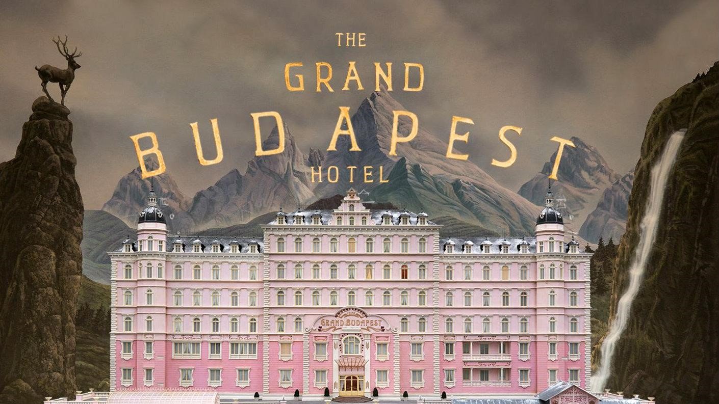
Like any self-respecting nation, the fictional Republic of Zubrowka has its own history, its own uniforms, a flag, but also banknotes, stamps, key chains, newspapers, books, candy wrappers, passports, and menus-with all their respective typefaces. This makes the film an enjoyment for the keen eyes of a certain typography.
The arduous task of bringing this fantasy world to life is entrusted to graphic designer Annie Atkins, who draws heavily from the typefaces in vogue in Eastern Europe in the 1930s. For example, the sign for the Grand Budapest Hotel is a rehash of an original 1930s metal sign from Cairo. But even more complex was devising the various newspapers printed in the fictional republic, whose articles were written one by one by Wes Anderson himself.
For the actors’ credits, in this film Anderson uses them Archer typeface – abandoning Futura once again. The Archer is a font created in 2001 for the American lifestyle and entertainment magazine Martha Stewart Living and later made public in 2008.
The Island of Dogs
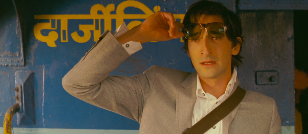
Released in 2018, The Isle of Dogs (Isle of Dogs) is Wes Anderson’s second animated feature film shot in stop-motion (we had covered this and other animation techniques here). Set in Japan, the feature film tells of a dystopian future in which all the dogs in Megasaki City are confined to an island because of a new canine flu.
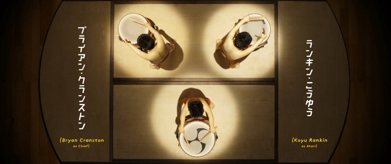
Once again Wes Anderson immerses us in unusual imagery: Megasaki City has a retro-futuristic feel and is, of course, very, very Japanese. Editing the lettering and typography used in the feature film is Erica Dorn, a designer and illustrator based in London but born and raised in Japan-her first experience with film.
Again, the designer had to create more than a thousand new objects, including posters, signs, beer cans, milk cartons and the custom dog tags. But particularly interesting is the lettering of the titles-a mix of Western and Nipponese characters that harmoniously bounce the viewers’ attention. The Japanese lettering varies constantly and was hand-drawn. In fact, as explained by Erica Dorn herself, it would have been difficult to find a suitable font: the typefaces that include all of the 2000 or so characters of Japanese writing are surely many fewer than those available in the West. The Western typeface in the titles, on the other hand, remains constant, as if to back up the strong Japanese visual. After considering several choices, somewhat at the last minute it was decided to draw this by hand as well.
So how much does the choice of typefaces and lettering matter in Wes Anderson’s films? Very much. Wes Anderson is a filmmaker with a deep visual culture, as well as being meticulous and very detail-oriented. He is well aware that the credibility of his imagery also depends on the choice of the right font, which is why every font we see on screen has laborious research behind it and numerous rejected proposals. And how much does he love the Futura font? Here, on the other hand, the answer is obvious: a lot!
To conclude, we would like to point out a little gem: a very well made short video (in English) celebrating Wes Anderson’s passion for fonts.